Monday, December 13, 2010

How Do You Decide What to Do Next When You Don't Know What to Do Next?

My husband and I have been writing a book for a few years now and it is getting to the point that probably what needs to happen next is a thorough Roto-rooter-like edit/proofread by me and then find a publisher. Or do I find an agent? Or is it neither of those things? Am I deluding myself that I could actually do any of those things? I started down the garden path to find a literary agent, then looked at some stuff people had written about getting a book published, then started looking at the book to see what sample copy I could send out, then started writing a cover letter to no one, then I realized that my head was swimming and I had no idea what I was doing or what I needed to do next and I know what a run-on sentence this is, I'm just using it to give you the idea of what it feels like in my head. My head is one big run-on sentence, and as an editor, I should know better, but it just never stops. In addition to the book, I am an artist. I show my work in a gallery here in town and also in my Etsy Shop on the internet, so I'm also an internet marketer of some ghastly variety. Plus, and more importantly, I'm a housewife and stepmom (and dog-mom).
So what do I do first? Do I work on said book? No, not at all. Instead, I work on something that I know how to do, putting off the probably much more urgent thing (the book) that I have no fucking clue how to do.
One of the first things I have been trying to work on is a book cover illustration!
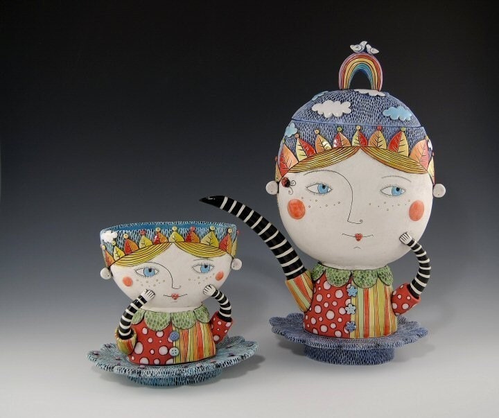
I rediscovered a former professor from college on Facebook, friended him, and discovered that in addition to being a brilliant physical chemist and concert cellist, he has written several novels! So upon mentioning my delight in this discovery as part of my Facebook friend request, he offered, "buy one of my books and I'll buy some of your artwork." So I bought one of his books (for Kindle, which I'm reading on my computer, since I don't have a Kindle) and waited to see what he would pick from my artwork. Better than picking something, instead he asked me to design the covers for his next three (I think he said three) books! I was flattered and excited and said 'yes' immediately, of course. So the first image in this post was the condition of the first cover, before I took it with me to the doctor with one of my kids and sat in the waiting room for 90 minutes. So that sketch is considerably further along than it appears in the photo.
Next...
As a consequence of being a stepmom and artist, I have volunteered to design my daughter's first tattoo, and her Dad is going to get (part of) the same tattoo with her. Fortunately for the creative process and unfortunately for my kid, said daughter had a terrible stomach ache on Saturday, sending us to Urgent Care, resulting in 4 hours trapped in a small, sterile room with a bitchy teenager. Needless to say, I got almost the entire drawing finished right there. Fairly excellent usage of a day I will never get back.

Next thing on the list, in no particular order, but that needs to be completed immediately along with everything else, is my Sketchbook Project sketchbook. I found one of the many, many links to The Sketchbook Project and thought it would be a fantastic opportunity to both do something creative and almost completely limitless in possibility and get some publicity by being part of this huge project that will be touring the country, then wind up as part of the permanent collection of the Brooklyn Art Library. Each artist chose from a wide variety of themes--I chose "Science project gone wrong" because, well, how perfect does that describe my scientific career. I can finally make a formal mockery of my own failings in scientific inquiry. Shown here is the back of the book. Those are the only marks on it thusfar. It must be postmarked by January 15th, 2011. Sigh.

Sunday, December 12, 2010

Featured Inspiration--Natalya Sots Amazing Pots!

Okay, she makes more than just pots, but I couldn't resist the rhyme. One thing I'm really loving about the new Etsy feature called "Activity Feed" (it's pretty much like the running status you get on your Facebook homepage) is how it keeps you up to date on everything any of your favorite sellers or people in you 'Circle' are doing--new listings, treasuries they made, items that they have added to their favorites, etc. This morning I had a couple of minutes so I checked it out. One of my long time favorites, Natalya Sots, had a new listing, and I was completely charmed by it! The Sunshine Girl teacup in the top picture is so adorable and has so many charming details, I was inspired to write about it. Click on the link to go to the listing, and be sure to look at all of her detail pictures, like the little braid going down her back and the tiny flowers! So sweet!
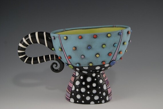
This blue cup (called Blue Cup with Pants) was the first item of hers I added to my favorites. It is truly charming and adorable. I wish I had the kind of home where something like this wouldn't get broken. Perhaps oneday.
As fun as her pieces are to look at, some of them are useful too! While I'm not sure if I'd really risk using either of the two cups (they'd probably just sit on a shelf where everyone could see them) this third piece is a butter dish! Can't you picture having Sunday brunch or tea with scones and serve your butter in this? I love her choices of colors and whimsical faces. While I do not create art with any functional purpose, I might just get inspired to create some drawings inspired by her fun faces and flowery patterns!
I have barely scratched the surface of her talents, so go check out her other lovely ceramicware in her Etsy Shop.

Friday, December 3, 2010

Fine Art Friday--A Little Lowbrow from Mary Lundberg

Her profile mentions that she has studied art all the way up to a Master of Fine Arts degree from the University of Memphis, has exhibited in both solo and group shows, and has been honored with awards for her work. AND YET I LIKE HER ANYWAY.

Aside from the immense talent, what drew me into her shop and made me check out every single category of art was, well, the categories she gave to her art. While other shops have categories like "Original Artwork", "ACEOs", and "Works Under $20", Mary has named her categories in a way that explains just what you're looking at, while the category titles make you laugh all by themselves. Her categories include "i use offshore banking"(works over $500), "lost my 401k but still love art" ($40-$65), and "art for the really poor" (<$12). The piece below ($50, since we're on the subject) is from a series of Trailer art, featuring bizarre and a little disturbing single-wide trailers. This mixed media piece I find awesome not just because it's a trailer and that the trailer appears to be walking, but that it appears to me to be wearing bellbottoms.
Single Wide Trailer #5, 4" x 4"

The artist is even honest enough to offer a category called "not my best work". It's nice to know that while I use my work from that category to give to people I don't like or to entertain my dog by letting her carry it around, Ms. Lundberg is at least trying to make a buck off of it. The work below, while not her best work, still cracked me up. Besides, the rest of that category I, um, didn't like. No offense, Mary, but it's not your best work. You said so yourself.


Last night, after checking out this shop, I thought about what categories I might use for my own shop. Using the same honest criterion, I was thinking, "papa needs a new roof", "mama needs a new dishwasher", "teenage daughter mascara fund" and "please buy this shit before I give it to my dogs to play with". It can't possibly be any less successful than what I've already got.

Wednesday, November 24, 2010

Cleaning Out the Closets--I Finally Came Up With a Good Christmas Gift Idea

So, in case you haven't noticed from all of the Ebay listings and other rants, I've been trying to clean out all the old stuff in this house that nobody needs. While preparing a very large donation bag of clothes, I noticed we had a ridiculous number of old Little League baseball jerseys of all sizes and teams. My husband (and I, unofficially) have coached Little League since our oldest was about 12 or 13. He's 19 now and his younger brother is 15, also now too old for the regular season play of Little League. So we considered this past Spring season to be our last season as Little Leaguers. It was a pretty good time, lots of great baseball games, lots of great kids and great parents. My husband and I have now both served on the Board of Directors, but I am trying to remove that part of the experience from my mind and just remember all the good parts. In remembering the good parts, I wanted to do something sentimental and cool with all of these old jerseys rather than give them to Goodwill. I'm thinking I will make a little throw quilt out of them, backed in some nice solid fleece. I think it would make a great gift for my husband for Christmas (don't worry, my husband has never read my blog, I don't think, and even if he does, we're not that big on surprises anyway). Does anyone have any helpful suggestions on making a memory quilt? I can tell you that the regular seams between the shirt-fronts will be done with a zig-zag stitch (I don't have a Serger machine, just a Singer). Should I pick a contrast color, like red, and have the stitching show? What should I do about the edges? I made a fleece blanket once by taking two big pieces of fleece fabric and cutting fringe into the edges, then tying the fringe together, so I suppose I could do that. I should probably make a decision on these things so I can get it done before Christmas, along with all the other stuff I'd like to get done in time for Christmas. Not to mention, daughter's birthday is coming up, and she wants me to design her tattoo. More to come on that...

Thursday, November 18, 2010

If You Buy All My Stuff on Ebay, I Can Go Back to Making Art


As much as I would love to be able to produce beautiful artwork that you, my readers, will instantly buy, providing you with thoughtful Holiday gifts and me with holiday gift-buying money, that just doesn't appear to be happening quite as rapidly as I would like. I know, picky, picky.

So I'm going through this massive collection of stuff that everyone in this house (especially me) has collected and now does not need. I have clothes that used to belong to my daughter before she decided she was too good for them, clothes I bought for myself, only to realize that either A) cute as they are, I don't look good in them, or B) have been sitting in my closet since the '80s and they are now in style again. There's also some diecast metal car models that no one in the house ever claimed to have wanted to collect. Jaguars? Nascar pickup truck? For real?

There are a million websites and late-night infomercials out there that will tell you how easy it is to list your stuff on Ebay. It is easy--to create a crap listing. To create a listing that people will look at and bid on, you need the same criterion as other online marketplaces. High quality pictures (yes, the skirt I'm wearing in the picture is for sale, and I used that picture because it sucks trying to take a picture of a plain black skirt, and Cassie wanted to be a part of it, so I thought that would be as likely to get someone to click on the listing as anything else), detailed descriptions, accurate measurements, and whatever in each of our brains passes for advertising and marketing. For the possible $50 or so I could get paid, I have spent ridiculous hours with the tripod taking pictures, editing pictures, measuring things, writing decent descriptions, checking on my listings, TWEETING (I couldn't believe it, but that actually got people to click on the listings), posting annoying pleas on Facebook... ugh! I must be doing it wrong. Maybe I need to market my goods the way these ladies have (NSFW). I appear to be stuck in that limbo between pathetic-but-getting-paid and dignified-with-no-Christmas-money.
So go check out my Ebay listings so I can get back to making some art. I've still got a book cover (or three, I think) to create, proofreading I could be doing, and daughter's tattoo to design (okay, that one I don't get paid for, but I told her I'd design it in time for her birthday in a couple weeks). Please someone come yell at me if one of my links doesn't work (but don't yell at me about the Regretsy listing, 'cos that's just funny shit, I don't care who you are).

Friday, November 12, 2010

Two Mo Bros for Movember

Well since October, Breast Cancer Awareness month, has come and gone (and I never got my baseline mammogram performed), we're done saving the ta-tas. Instead, now, for November, we are saving the... um, testes? Sorry, that was bad. Anyway, November is Men's Health Awareness month, and just to jazz it up and give people something to do, in addition to donating money, the month has been renamed Movember. The 'Mo' is short for 'moustache' (one of two proper spellings of the word, I'd have to ask my friends at Scribendi.com if one is British English and one is American. I do know that the fine wordsmiths at Scribendi are participating in Movember!) and to raise people's awareness of men's health issues, men (Mo Bros) are supposed to grow out their moustaches for the whole month of November, and us gals (Mo Sistas) are supposed to cheer them on, assist with grooming, measuring, possibly braiding, and there will no doubt be moustache rides involved in there somewhere, but I'm trying to keep this blog above board, so we're no going to talk about that part. In addition to the growing of hair, there are opportunities to donate and promote donation by others at the Movember website. Since I am thus far unable to grow a moustache myself, I am supporting the cause by creating some Mo Bros of my own.

The first fellow came out decidedly sinister looking, and since he is the first, I have named him"Mo". He has been created in pen and ink, as well as some brushed inks, including the new colors I bought at Langell's the other day. "Mo", the original, is currently for sale in my Etsy Shop, and the full sale amount (not shipping) will be donated to the Prostate Cancer Foundation via Movember.com. (The other major charity organization featured on movember.com is the Livestrong Foundation, and while I'm sure it has probably done some good in its day, Lance Armstrong is a douchebag and I'm not giving him my money. Hey, it's my blog and my opinion, and for the record, it's not just my opinion.) Moving on... I will probably make some Mo prints (get it, mo' prints, mo' money, mo' Mo?) and sell them for a more reasonable price, that way everyone can share in the love of Mo-ness.

My second Mo Bro is the as-yet-unnamed walrus-y moustachioed dude shown here. He is also done in pen and ink as well as brushed ink and colored pencil. I scanned him yesterday, then added a bit more colored pencil to the face area, but when I went to scan it again, suddenly my awesome-if-geriatric HP scanner has decided to utterly fail. Now I need to start a fundraiser to buy a new scanner/copier/printer. The second Mo Bro is not available for sale yet, but I will probably put him up for sale the same way, with all proceeds going to the PCF. If I do manage to get a decent scan of him, I will probably print some out as prints as well. While offering prints at a lower price than the original is a good idea, I will probably need to subtract out a certain percentage to offset the cost of printing them. Making an original costs very little, and I consider my creative time a donation, but making digital prints is rather expensive. Plus there's the whole scanner issue. Time to go join my compadres at Scribendi and start earning some Christmas money. (Yes, I know, it's hard to believe that the same person who writes this spew of a blog is also a proofreader and editor. Consider this 'getting it out of my system'.) Please enjoy these Mo Bros, be on the lookout for more of them before the month's end, and, should you feel so inclined, go to my Mo Space (yes, they're really calling it that) and donate!

Wednesday, November 3, 2010

Getting Inspired by Ink

So today I made the excuse of having to pay my shop fees to The Wooden Cow Gallery in order to drive by Langell's Art Supply. I live on the west side of Albuquerque, which has much newer houses and development than the east side, but as such can be severely deficient in certain things. We have no traditional old diners, there are few really nice restaurants, and no real art supply stores. Yes, we have Michael's and Hobby Lobby, but no place where you can go for specialty goods, like high quality liquid inks. Once I got to Langell's today, I walked up and down every aisle to make sure I really didn't need anything else, and wound up with a roll of framing tape (the brown stuff you put on the backs of framed artwork) and several bottles of ink. I also got to get real advice on a product I had never tried from someone who had used it, and could even show me what he'd done with it--you can't get that at Michael's either. I wound up taking his advice and choosing 3 luscious colors of Dr. Ph Martin's Bombay India Ink--Teal, Cherry Red, and Terra Cotta. I also got a bottle of Koh-I-Noor black India Ink, as it is recommended for my Rapidograph pens. I am guilty of having used whatever ink I had on hand in the past, and we'll see if this ink is less susceptible to clogging.
My final bottle was Higgins Red Violet, to replace a bottle I'd just used up, part way through the project photographed above. It is a waist cincher that I found on Ebay for a steal because the pretty lace all over the front of it was orange and yellow. I've worn it once or twice as it was, but I seriously almost broke out in a chorus of Gypsies, Tramps & Thieves while wearing it. So the other day, I got out the waterproof red + red violet and brushed it onto the lace. Much to my delight, it came out a juicy deep red, though a bit uneven, as the different shades of yellow and orange soaked up different amounts of ink. After going over most of it with one coat, I decided it really needed another one to even it out a bit more. It may not be painting on a canvas or paper, but it's a start, and was a successful artistic project that was worth sharing.
Now it's time to go take down the Halloween decorations before it gets dark.

Thursday, October 14, 2010

Everybody's a Photographer--Except Me

Today's seemingly meaningless rambling is brought to you by Behr Ultra Exterior Semigloss Paint with built-in primer. Next time I'm sweating out what the magic formula was for this paint trim color, one of you fine readers be sure to chime in with, "Hey, dumbass, check your blog." Okay, this isn't the original paint color I chose, because I left the last part of the remaining bucket of paint out in the sun, which ruined the label, then, apparently, left it not quite sealed, which then got rained in. So the color below is the color of the stick that I stirred up the watery paint with to bring to the guy at Home Depot. After Tuesday's work dried, I realized that the new color is slightly darker than the old color, so, hey, I was going to put on two coats anyway. That "primer built right in so it only takes one coat" thing is bullshit anyway.

I've been trying to get the exterior surface of my house repainted for about, um, 4 years now, I think. Maybe longer. Considering the exterior surface is primarily NON-PAINTABLE BRICK, it doesn't, in theory, seem like that big of a job. Besides, it's a one-story ranch, so quit your whining, right?
So here you can see part of the painted trim, along with the old color, the sort of pinkish, pukey beige off to the right (there's just a little of it left above the furthest-right window). Can't imagine why I'd want to get rid of that.
As you can see, there's lots of trim right next to main body color (the light yellow) and plenty of opportunities to smear the one color into the other. I keep going to smaller and smaller brushes and getting less and less accomplished in each session. That back room, trim only, took two days. I'd get my kids to do it, but a) they'd demand compensation, whereas I'm free, and 2) they'd wind up getting paint everywhere but where I want it and I'd have to do it over again anyway. Or have bluish-greenish dogs. Speaking of dogs...Cassie said I should take some pictures of her and post it on my blog because I'm such a good photographer. Can I state for the record that I am the one person left on this planet who owns a nice digital camera, knows how to use it, but does not think nor say she's a photographer? One of my friends posted this humorous bit on Facebook the other day about a poor wedding photographer trying to negotiate with a new client about what she wants for her wedding versus what she's willing to pay, versus her uncle who owns a fancy digital camera. It's truly sad that even while I get that I (like everybody else) don't know Jack about photography, I (probably like everybody else) also don't really know how to appreciate a well-done photograph. Just like any type of artistic expression, most photographers out there have a body of work that they have solely created to impress other photographers. Painters do it, other visual artists do it, musicians do it. Regardless of the fact that those of us outside of your area of expertise don't give a crap. The rest of us just want to see your pretty pictures or hear your beautiful music. Probably writers do it too. Writers who know they can write will write these remarkably complicated story lines with sophisticated characters with complex lives and the deepest souls you can imagine, if only you can get past how darn sophisticated and chock full of context and meaning the writing is. That's why I write this blog in the style that I do. It entertains me a little bit, and I comprise about 33-50% of my audience. It's liberating to know that almost no one reads my blog, and then, every now and again someone stops by and leaves a comment, and it's a nice little surprise. Please enjoy my utterly non-professional snapshots and my own personal way of writing about it. Time to get back to the real world.


Wednesday, September 29, 2010

My First Successful Tatting Pattern Creation

I just finished the second half of this tonight, which was the real kicker as to whether I did it right or not. I wanted to invent something with a little crisscross in the middle, but have never tatted anything where I had to measure my picots (the long loopy things that I have crossed over in the middle). This is my second attempt--the first time I just eyeballed it and the picots were much too long, they wouldn't have laid flat once crossed over. I think maybe this pattern might make a nice bracelet or a Gothic choker with a cameo dangling from it. For now, I'm proud of myself for having figured out the fuzzy geometry well enough for it to work. It reminds me of a club from a deck of cards--perhaps this one will be called 'The Queen of Clubs'.
Back to proofreading now. I think my next few blog posts will have something to do with my husband's and my book. Stay tuned...

Saturday, September 25, 2010

If They're Not Goat Heads, What Are They?

When we last met here at the Easily Distracted Blog, I was profoundly expounding on the freaky-looking weeds in my back yard that I did not know the name of. As it turns out, I did know the name (Goat Heads) , I was just using it to refer to a different plant, these bastards:

I know these look kind of like regular crabgrass from the first picture, and they are clearly related to crabgrass, but these are crabgrass with deadly spikey seeds coming off of the ends in clusters.

You can see from the branching of the blades and the root structure how much they look like normal crabgrass. The first time you bend down and attempt to yank one of these out of the ground you will think it's crabgrass, until you grab hold of it and get a whole palm-full of spikes in your hand. Check out the ends with the seeds themselves.
(Okay, also check out my awesome nails. I feel like I painted them with a flannel suit.) Each individual seed has (I think) 12 spikes coming out of it, and the seeds pop off one at a time and will lodge themselves into just about anything. The little spikes seem to have barbs on them, as they are difficult to get back out once they are stuck in your skin. After removal, the skin is irritated for a little while. I can only say that's true for humans, my dogs, once they stand there and refuse to move until I risk my own safety and pull them out, seem to get over it pretty quickly. As a further side note, Cassie, the Aussie Shepherd, won some serious respect from me the first time I saw her walk through a patch of it. Let's face it, she's walking Velcro, so ten or so of them lodged in the spaces between her toes as soon as she stepped near them. She sat down, turned that paw over and chewed each sticker out with her teeth and spit them out. It was like some old war movie where the hero chews the bullet out of his own flesh and spits it out like he's John Wayne or something.
As summer goes on, the older seeds dry into little brown, hard versions of the same thing, which is when they become truly indestructible and can lodge themselves in your flesh with wood-splinter-like tenacity. Even after the spikes break off (like after they've punctured your bicycle tire) the core of the seed is still rock hard, getting lodged in tire and shoe tread grooves everywhere, thus furthering they're dissemination throughout the Westside of Albuquerque. I'm not sure why these haven't completely taken over the world yet, as they seem to come back all up and down our street with the slightest rain. If any of my Southwest-savvy readers have any idea what these are called, I'd love to know. Now that I know what a goat head really is, I have discovered that there's actually a fairly specific weevil that eats them. I'd love to know what, short of Godzilla, eats these.


Wednesday, September 22, 2010

Funky Spaceship Weeds in my Back Yard!


I just pulled up a bunch of weeds in my yard yesterday and decided to take some pictures of them because they are so bizarre looking. The plant has a woody, rather fragile tap root and the plant sprawls out in all directions with pinnately compound leaves (each leaf has a stem off of which come several leaflets, like a fern), little yellow flowers and these green
seeds with spikes on them.
It is the seeds that take this plant over the top from "hey, that's a kind of cool looking weed, I think I'll let it live," to "WTF!!?? Tiny invaders from another planet are here to violate our housepets (and possibly explain the origins of Velcro)!"

There is an artist named Kathleen Dustin who creates purses and other decorative, functional objects from polymer clay in the style of strange seed pods and whatnot. She came to The Wooden Cow and gave a talk about her work. I need to send her these pictures because I totally need a purse like that seed. Don't you think? Nobody would f**k with me in line at the bank, that's for sure.

In fact, it reminds me of an illustration by Patrick Woodroffe that I have in a book somewhere... I think the one I was thinking of was from his book "Mythopoeikon" and is called "The Thorn Apple Tree." Here's a snapshot of it from my book.
It is a beautiful book, by the way. You can go buy a copy of this fantastic art book on Amazon here.

Sunday, September 19, 2010

Win a $20 Gift Certificate Towards Lovely Handmade Jewelry!


One of my favorite jewelry makers, Bits 'n Beads by Gilliauna, is having a promotional blog contest on a blog called IndieSpotting. I just clicked out a bunch of entries for myself, but now you can too! Gilliauna makes some lovely jewelry with semiprecious stones, silver and gold. Go check out her lovely shop and perhaps you will find something you would like to spend your $20 gift certificate on.
Here's the link to the contest:

Sunday, September 12, 2010

Trying to create a new tatting design!

Okay, yes, I know I really need to get back to drawing, which is what I do, right? But in the meanwhile, tatting has become a fun distraction. I think between that and the shrink plastic stuff and the limited amount of wire-wrapping I've tried, I could open a new shop with jewelry, almost as scatter-brained in focus as my art shop!
My latest project is an attempt to design my own pattern simply based on ideas from others' works that I have seen. The flower motif that is stained with purple around the edges was my first attempt, and while I think it looks pretty, it doesn't lay flat and the petals of the outer flower motif overlap, which wasn't what I wanted. Still pretty though, so I was going to use it as an experimental piece and perhaps add that pretty crystal sitting next to it, maybe as a dangle coming out of the middle. The piece that is still white is my second attempt and only has a couple of mistakes. It seems to lay flat a little better, and I think it looks like a pansy, so I will probably stain the middle yellow and put some purple and blue around the edges.
I wish I knew someone in the area who also needle tatted; it would be nice to be able to look over someone's shoulder or ask questions at key points to see if there is a tidier way to do certain things. Without that benefit, I will just have to continue combing the internet for advice.

Thursday, September 9, 2010

Tatting--Another Distraction


Tatting is a form of lacemaking that dates back to the early 19th century, and, according to Wikipedia, is inexplicably thought to be derived from the French word frivolité, reflecting its complete lack of usefulness. The only other remotely interesting thing Wikipedia had to say about it was that it has been used for occupational therapy, to give recovering patients something to do with their hands. I totally get that.

I learned shuttle tatting as a bored kid from some old craft instruction booklet my Mom had, and that method of lacemaking is a fairly annoying tangle of Cat's Cradle-like knots and holding your hands and fingers just so and getting lots of knots that were not part of the instructions that
require a magnifying glass and a needle to undo (if you aren't willing to simply throw the piece away and start over). This pastime was quickly and wisely set aside for crochet and knitting and, well, art.

When I started selling my fine art on Etsy, I wandered randomly through all the categories of
handmade stuff to see what was there, and amongst all that stuff, I found
people who did tatting.
They made the usual useless doilies and lace collars, but then some of them made jewelry--really hot, Goth, steampunk, kick-ass jewelry. So I looked up some of these artists to see how they did it, and they mentioned this term called "needle tatting". I bought some tatting needles (long, straight needles with no points on the ends), procrastinated a while longer, then finally hunkered down, read the instructions, and figured it out. I had had this idea rattling around in my head that this type of lace might look really cool hand-dyed with permanent inks, so, after finding some patterns I liked, I tried my idea. Apparently, it was a fairly good one, or at least I think so. I'm not sure if I am going to sell these items in my same store or if I'm going to take them over to The Wooden Cow here in Albuquerque to see if they sell, but I'm building up quite a collection, so I guess I'd better share it. With that thought in mind, I'm sharing it here to see how it does. This last photo is the first set I made, a choker and earring set, hand dyed with turquoise ink to make a gradient going across each piece. My husband also thought it was a really nice picture, despite Mimi having her tongue stuck out.

Wednesday, September 8, 2010

I Guess I Should Get Back To My Blog

I just purchased my second batch of Moo Mini cards with about a jillion different images on them. They are so fun and eye-catching and cute that people should want to take them. I intend on leaving them in conspicuous places for people to take and then perhaps maybe check out my website once they realize it is a business card.

As I was looking at them today, it occurred to me that the web address for this damn blog of mine is on them. Well crap. Now, I love to blather on about myself and my own selfish interests and pretend someone else cares as much as the next person, but I really can't stand blogging. That's not to say that I don't read my friends' blogs because I want to read about some contest they're sponsoring or about their personal dysfunction for my own entertainment (Yes, I mean you, Erin), but as far as my own desire to waste time in THIS PARTICULAR WAY, it's just not my thing. I'm sure I'm interesting to some people, but let's face it, part of the reason I am a visual artist is because visual art doesn't necessarily need an explanation. You either like it or you don't.
But I understand that part of being an artist is letting people know who they are buying the image from. Something that helps the viewer connect with what they are buying and (hopefully) hanging up in their own home or office. Something they can relate to, or laugh about, or feel sorry for, or be proud of, or whatever.
So here's your little tidbit for today to get to know me by. My artwork is not usually chock full of meaning, I probably just created it because I thought it was a good idea at the time. Sometimes I think of a great title for an image before I've even imagined the image. For instance, the drawing "Redheads Just Aren't For Me" is, well, a portrait in effigy, and, well, the title pretty much captures the full scope and give-a-fuck-ness (yes, I know there's a real word for that, but it's my blog and I just made it up and I like it) of how I felt about a particular person at the time. Granted, I'm
pretty much over it now, but the picture came out, IMHO, pretty f***ing awesome (I hate cussing more than once in a single blog post) so I'm still pretty proud of how I used my own snarky sarcasm to mock my own pain and create it.

Then on the other hand, sometimes I imagine a picture, either in part or in its entirety, and never think of a great title and that always really bugs me. I look at it and think the image is awesome, and I show it to my friends and
family and random people on the street in the hopes that they can do my job for me and help me come up with something besides "Untitled". I wind up just using whatever lame title I can think of and running with it, like "Purple Cat", "Weedy Study" or "The Seer". "The Seer" bugs me the most, because the title really makes it seem like it should mean something, but it's just a cool picture.
So there's some insight about me, and I will try to get better about writing shorter, more interesting posts about myself and the wacky sh!t I do. I promise not to blog about ironing shirts.
Tomorrow's topic, all this crazy lace I've been making, and how I feel about tatting! Sounds pretty all-encompassing, I know, but try and hold out until tomorrow.

Saturday, May 15, 2010

Selling Artwork is a Marketing Conundrum


Something I just cannot seem to figure out is how to market my artwork and get people to come and buy it. I've read many a blog post and a helpful Etsy Forum discussion, and I have even purchased someone's pdf about how to increase traffic and sales to my shop. I spend what I consider to be large amounts of time generating interest and getting feedback on my work via Facebook, Etsy Forums, twitter. I write clear, detailed descriptions and try to use properly enticing and search engine optimizing words in my titles and descriptions. I offer works that anyone could afford if they wanted to. Yet, my sales are few and far between. Plus, when the sales do come, it seems completely arbitrary. I love that a bunch of my sales have been from total strangers all the way across the country or the world, but that leaves me with no clue how they found me, nor how to find more customers like that.
Now granted, I know my shop probably has issues. No two items in my shop look like they were created by the same person. There is no unified 'look' to the shop, no prints offered in multiple sizes, no color schemes, no theme. I do not blog every week to keep people interested. Most of my work is purely art for art's sake, it serves no other function, save the few greeting cards I sell and a couple of pieces of jewelry. I'm sure I am neglecting other opportunities to make money, either by the narrow focus of products I sell or my own inability to get the word out.
Yet, there is so much advice out there, free as well as for money, one person could not possibly do everything and create new products at the same time.
For the past few weeks, I've been trying to simply generate new works, finish some old ones that have been almost finished for too long, and market by way of generating interest by showing works in progress and asking for critiques. This approach has resulted in lots of great feedback, many gushing compliments, a couple of requests for custom work (which is awesome and don't think I'm not flattered and grateful) but utterly no sales.
So I am taking a step back to try to see what I can do to focus my approach. For a long time I have been considering opening a second shop for jewelry and wearables. There'd be some polymer clay jewelry, some simple shrink plastic jewelry, some non-precious-metal wire wrapped jewelry, some altered thrift-store finds, perhaps some hand-painted shoes and purses.
Alternatively, I have thought about doing more with paper, but making it something useful. I already make a few greeting cards, but I could offer some of my digital prints as mini cards, plus make some new styles geared exclusively towards card giving. I was also considering making some hand-drawn or hand-painted notebooks and journals. I have even been offered the suggestion of making coloring books for adults from some of my images.
So I am asking advice of my readers: Which of these suggestions sound good to you? Is there stuff I haven't thought of yet? Do I have the wrong take on something? Straighten me out!

Monday, April 19, 2010

Back to Work...Well, Sort of

This weekend was full of Little League Baseball games, cleaning up the yard, rain (not a good combination), and a little bit of drawing. I took my sketchpad to the ball field (Usually when it's my own kid's game, my husband is the coach and I'm official scorekeeper. This Saturday, my kid was pool-playing for another team because they were short.) and started in on this idea I had after being inspired by some other people's work. My husband accused me of making this little creature to resemble someone from Little League, but if I did, it was subconsciously influenced only.
He was only about half-way finished by the time that game was over, and a brief jaunt to Taco Cabana later, I was back at our home field acting as Field Monitor (exactly as interesting as it sounds). After finally getting to consume my Taco Cabana burrito, I was sitting on the bleachers at a girls' softball game, finishing him up. Despite the home team's designated Chihuahua's best attempt to pose as my model, I finished him all up and put the book away to avoid any damage or criticism.


Yesterday morning, I scanned him in and got him all digitally gussied up. I switched up his colors, started with some color in his main body, then thought better of it and just left his main body white. Overall, I really like the way it turned out!
I guess it's time for me to get back to all of my other work, now. I have quite the list of responsibilities I've got to take care of today.

"Mister Softee" is now available for sale as a 6" x 8" archival print here.

Friday, April 2, 2010

Digitally Enhancing Sub-Par Drawings Works!

I was never a huge proponent of digital manipulation in and of itself, but I've been using it more and more to clean up drawings and, better yet, to add color to them! My last blog entry about Eric and the Fake Beard was an example of one that I never would have wanted to add the color with a brush, and it turned out to be a great combination of natural-looking drawn lines and the crisp perfection of digital color.

I did a similar thing a couple weeks ago with "The Frog Princess." She was a relatively simple ink drawing who simply needed a little polish by way of digital color. For that one, I even got a regular laser mouse to use left-handed, as opposed to the track ball mouse, which must be used right-handed and has less control (to me in my hands). Here she is:

I like how you can give something a subtle gradient from one color to another, or just one color to white.

So as I was perusing some of my Etsy Favorites, I came across a pen and ink artist who puts different colored backgrounds behind her botanical drawings, and even lets her customers choose which color they prefer. Her name is Jodi Davies, and she goes by jodidoodles, if you would care to check her out. (Since everyone's tastes in art are different and every artist has a different style, I don't really feel all that competitive about pointing out other awesome artists.) I thought that the different colored backgrounds with a black and white foreground was a cool idea, so I tried it on one of the drawings I finished this week (okay, the only drawing I finished this week, shhhh!).

Not only did I add the colored background, but this was the first drawing I can honestly say that I completely altered on the computer. While I was fairly happy with the flowers and leaves around the face in the middle, the face itself just looked awful. And awful in ink is a fairly permanent type of awful. But not letting a little temporary lack of drawing talent hold me back, I scanned it in and proceeded to rip the face to shreds on the computer. There was much too much crosshatching on the eyelids and the face itself was not in the middle of the circle where it should have been. I was just having an off day. It happens. But through the wonders of the digital age, I fixed most of what I disliked about it, tried not to go completely crazy fixing blemishes (kind of like putting your makeup on in the magnifying mirror, cleaning up images on the computer can get a little OCD). Then I added a square of color behind it, and picked three colors to start with as the background. Here is the result:

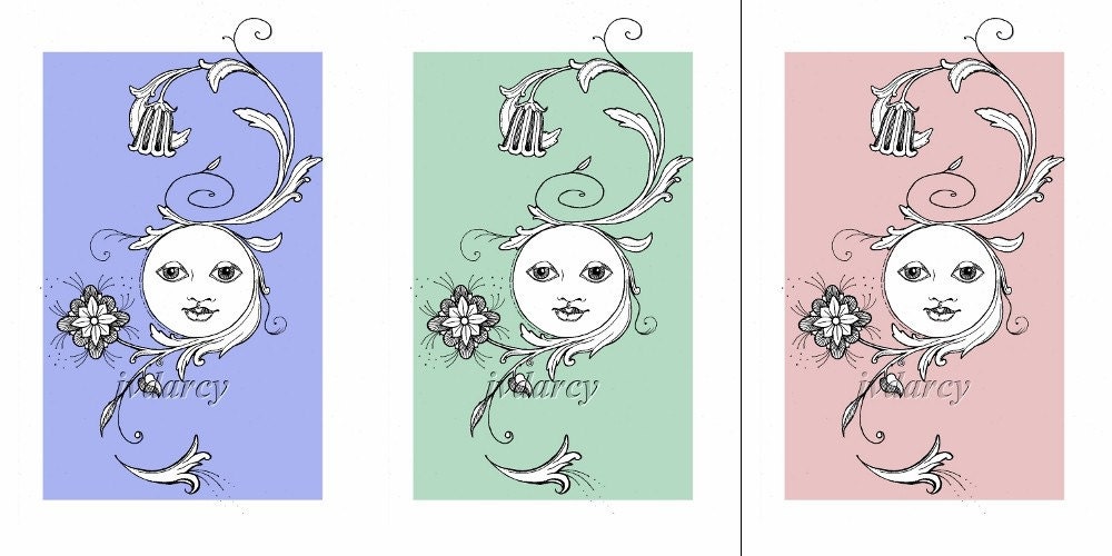
Clicking on the image above will take you to the listing for the green one, but I made a listing for each of the three colors, in case one caught someone's eye more than the others. Also noted in each listing, if any of my readers would like it in another color, all you have to do is ask! I'm not sure if I will do any more like these, but it was certainly fun and a good exercise in digital manipulation. Please let me know what you think!

Thursday, March 11, 2010

New Print! Eric and the Fake Beard

Eric and the Fake Beard

Most of the rest of the family was used to Eric’s flippant “one-eyed salute”, but tonight he seemed in an especially jovial mood. He bounced down to the dinner table wearing what appeared to be the remains of Aunt Edna’s favorite orange mohair sweater (quite honestly, everyone else hated the thing) tied by two strings around Eric’s neck.

“That better not be my favorite mohair sweater, boy,” snorted Aunt Edna as she came around the corner from the kitchen, wielding a plate of steamed vegetables and squinting at him suspiciously through the steam that had collected on her bifocals.
“You look like that wino that hangs out down the street under the bridge,” commented his sister, Juniper. “Only he bathes more!”

“June! Stop picking on your brother and go get me a serving spoon,” snapped a now-visually-acute Aunt Edna, having cleared the steam from her glasses. “I sure wish you’d ‘a asked me before you went and tore up that sweater,” she continued. “Though, I reckon it was getting a little long in the tooth.”

“Edna,” Eric’s Dad interrupted, “that sweater could have been the wino who lives under the bridge.” Everyone laughed at that, even Aunt Edna. Eric, lapping up the spirit of good humor at the table, continued to dance around, wiggling his homemade fake beard.
“Check it out,” he giggled, “I’m Brad Pitt!”

This print was inspired by the humorous illustrations of my Facebook friend, Erik Bergstrom (I modified the spelling of his name to protect whatever innocence he may have, plus I forgot to look to see how he spelled it). Okay, I guess it was also a little inspired by Brad Pitt, thought I hate to admit that, since I've never thought he was a handsome man in the slightest, so him growing some ridiculous homeless-wino-hippie beard has had no other effect on me except to make me chuckle. I actually got up in the middle of the night to draw this thing, and couldn't go to bed until I was mostly finished with it. The next day I finished it, scanned it in and added the color in The Gimp. The most difficult part was writing the story that went with it, since I'm much more of an editor than a writer (now watch me litter this post with typos...). So I hope my readers (both of them) don't think my story is too lame, it was the best I could do.
The print is for sale in my Etsy Shop here.

Tuesday, February 16, 2010

The Year of the Tiger!

Happy Lunar New Year! The New Year in the lunar calendar started on February 14th, and this year is the Year of the Tiger! To commemorate, I drew this tiger in black and red-orange ink yesterday! I had some fun with the contour-y, swirly, maybe a little mokume gane looking orange ink pattern. The black ink is waterproof Black Magic that was applied with a brush, and the orange ink was drawn on using my 0.50 Rapidograph drafting pen.


The lunar new year is celebrated in many Asian countries, and there are many shared traditions as well as ones unique to each country. The calendar is based on the Lunar (or Chinese) Zodiac. Similar to the Western zodiac, the Chinese zodiac has 12 different attributes, but each sign is given to a year, a month and an hour of the day, thereby creating the possibility of three different signs that lend attributes to a person's persona, based on when they were born. For instance, if you were born yesterday, February 15th, 2010, at 5 in the morning, you were born in the year of the Tiger, the month of the Tiger (your inner animal), and the hour of the Tiger (your secret animal). However, if you were born on, say, July 11, 1967, at 5:53 pm EDT (to use a completely arbitrary example, having nothing whatever to do with the day I was born...) you were born in the year of the Goat, in the month of the Goat (inner animal) and the hour of the Monkey (secret animal). The animal representing the year of your birth is the persona you portray to others, your external appearance. I'm not sure if I understand the meanings of the inner vs. the secret animal, except that the secret animal is the most personal, since it represents the relationship of the sun to you at the hour of your birth. Each of the animals also has an attribute of one of the five elements: Wood, Earth, Water, Metal, and Fire. These elements each contribute to the personality of the animal in some way.
The Year of the Tiger drawing measures about 8" square, and is available for sale in my Etsy Shop for a rather economical price.
Happy New Year all! Welcome to the Year of the Tiger!

Thursday, February 11, 2010

5:52 Salacia


5:52 Salacia
Originally uploaded by jvdarcy
Salacia was the bride of Neptune, the Roman God of the Sea. The story goes that when Neptune was pursuing her, she was so intimidated by his greatness that she fled and hid in the Atlantic. Neptune sent a dolphin out to bring her back, and because the dolphin was able to charm her into marrying the God, Neptune gave the dolphin a place of honor amongst the stars, the constellation Delphinus.

This is my piece for Week 5 of 52 Weeks of Creations! I was a week behind, so I just decided to call this one my contribution for this week instead of last week. She started out as simply a study in ink textures and was really fun to create! The only un-fun thing was changing the ink in the pen (my 00 Rapidograph, see rant below) from blue to green, then remembering to wash it all out when I was finished so the ink wouldn't dry that way. I have some really interesting photos of what happens when you let the ink dry in the mixing cup...

Salacia measures 6" x 8" and was rendered in pen and ink and brushed liquid ink.

Monday, January 18, 2010

Rapidograph Rant.


So, being the child, step-child and grandchild of professional writer stock, I'll call that my excuse to love pens. I do, I love pens. One of my earliest memories of drawing anything involves these cheap, black metal ballpoint pens with some sort of government inscription on the side that my Dad always seemed to have laying around the house (in my vague, couldn't-read-yet, three-year-old's perspective, I want to say they just said "U.S. Government" on the side, but since I couldn't actually read yet, they could have said "Uncle Barney's Government Surplus and Podiatric Supplies," yet, I can hardly see how that would have fit on the side of the pen). Those black ballpoint pens were so sleak, simple, fun to chew on and made a nice, even, smooth line on whatever paper I could find (or the radiator in the dining room). Since that time, I've gone through many different styles of pens: Ballpoints, which eventually grew thin on my patience with their inconsistent skipping and oily, uneven marks, erasable pens, which, until I learned to write sideways, simply amplified the left-handed curse of "black pinkie knuckle," rollerballs, which, though beautiful, smeared way too easily, no matter how long I left myself in suspended animation with my hand poised above the page, thinking, certainly, it was dry by now.

With this love of permanent writing impliments, coupled with my artistic inclination, it was only a matter of time before I went down that slippery slope to my affection for drafting pens. For whatever reason, my fascination with their permanent, archival nature was only peaked when I found out that you could buy them with tips so fine you could perform a trachiotomy on a housefly with one. Not cheap these little buggers were, either. And it seemed, the finer the point, the more expensive they were, and the more difficult to care for. It seemed also that the tiniest of points on these pens were also insanely fragile. Couple that with the fact that the diameter of the tip now approached the molecular diameter of the ink particles, and you've got a rather expensive, no-one-told-me-this-was-a-one-use-only pen. As a teen, I managed to save up my nickels until I could afford to buy one of my own, only to get completely burned by my own lack of experience and care, getting the thing utterly clogged with ink and the tip bent irreparably at the same time. I have no idea what happened to that pen. I hope it is burning in pen hell.

That being said, I completely forgot this lesson a couple years ago (or perhaps I thought I was mature enough, as those of us over forty sometimes think, to own something complicated and expensive without effing it up) and bought myself a set of four Rapidograph pens from Koh-i-noor. Old school, just like the one I toasted in high school, only now there's four of them. I had completely forgotten the labor involved in keeping them functional, and today is a lesson in patience, wherein I am presently waiting for the nib of one of them (pictured above) to dry after cleaning the clots of old India ink out of them. I really just wanted to draw something real quick and be done with it.
But hey, my loss is your, well, also loss, since this is probably the most rambling-on-about-nothing blog posting I've ever written. I think the nib is dry now, but now someone needs to be driven somewhere, so I guess it'll be especially dry by the time I get back.

Monday, January 11, 2010

New Year, Resolutions, and a New Project!

In honor of the New Year, I decided to create a new project for myself to keep me productive throughout the year. I had considered joining one of the groups on Flickr or Facebook along the lines of "52 Weeks of ..." but I couldn't find a project that I really wanted to do. So I started my own group! I sent out invitations to all of the artist friends I have, and now there's a group of about 45 of us. The idea is that each of us commits to ourselves to start and finish one piece along our chosen theme each week. The theme and medium is up to each participant, as we have photographers, painters, jewelers, a bit of everything, and we all seem to be inspired by different ideas. I couldn't decide, so I chose two, 52 Weeks of Creatures and 52 Weeks of Vocabulary Words. We also have 52 Weeks of: Squares, insects, monsters, journaling, spirituality and "undeclared" (I think there's a bunch of those--don't judge! It's enough for most artists just to commit to this kind of schedule in the first place!).

You can find the group here: 52 Weeks of Creations!

Here are my entries for this week. The first one is for 52 Weeks of Vocabulary Words, and this week's word is "Miasmata":
miasmata. n. plural of miasma.

1. noxious exhalations from putrescent organic matter; poisonous effluvia or germs polluting the atmosphere.

2. a dangerous, foreboding, or deathlike influence or atmosphere.

While the singular, "miasma", is pretty cool, I thought the plural of this word was even better. In the olden days (before the germ theory of disease transmission) it was thought that illness and disease were emitted from dead and decaying materials and that they carried through the air like a spirit.


Entry #1 for the 52 Weeks of Creatures is my "Devil Child Waiting for the Bus":

She requires far less explanation. She is simply a little girl waiting for her bus. She just happens to have horns and a tail, for which her Mommy has lovingly crafted her a matching set of hat and, umm, tail-mitten?
She reminds me of the two adorable girls (twins) who lived behind us. They were the cutest little blue-eyed blonde girls, who would spend their spare time verbally torturing our dogs over the wall and trying to knock birds' nests out of trees with sticks. I used to call them the Evil Twins.
Just because something's cute doesn't mean it won't try to eat your face off.
Neither piece is listed for sale in my shop just yet, still trying to decide if I should do so. Stay tuned.