Monday, August 25, 2008

My First Fully Digitally Created Collage


Okay, there are too many adverbs in that title, but anyway...

Today I listed a completely digital creation. I created it as several layers in The Gimp. For those of you who have never heard of that, the Gimp is a shareware graphics program built originally in Unix (the name is really an acronym--Gnu Image Manipulation Program), but which has also been made available for Windows. It can do many of the cool things that the pricey Photoshop and others can do, but it is utterly free! All you have to do is figure it out. I have been able to figure out a few cool things with it, though I am not exactly a whiz or anything. I was able to create this nifty new digital collage, colorizing and combining a silverpoint drawing that I had scanned and have since misplaced (yikes!) with the electron micrograph that I had digitally scanned last month (see my post about it). I think it came out pretty well! You may click on the picture to go to my Etsy shop and purchase one for yourself!

Wednesday, August 20, 2008

Inspirational Credit Where Credit is Due


My previous post was about my new little bunny headed, long-necked, volumetric flask-bodied creation, and a little about how it was inspired by some Etsy doll-makers. I tried to include as much of my genuine inspiration in my treasury as I could find, but then I remembered another artist who I do not believe sells her work on Etsy, but is instead represented by real (b&m) galleries and her own website. Her name is Denise Greenwood, and somehow I found her on MySpace (lucky for me!). Her work can be found on her website (http://www.artofgreenwood.com/) and an example of her interesting characters is shown here. Love those lips, Denise!

Monday, August 18, 2008

Something Different--in Three Dimensions!


I just completed a treasury on Etsy of my favorite 3D figures, and these works have inspired me to create a figure of my own! He's still a work in progress, but he is tentatively named Erlen Meyer (Erl for short) because he reminds me of an Erlenmeyer flask. He is not solid polymer clay--I made him a coat-hanger armature, put a rock from the yard in his butt to make him more stable, and fleshed him out a little with aluminum foil. He stands about 4 inches tall. He's not quite ready to be baked yet, as he needs feet and probably a tail--not sure yet. I will also have to wash the dust off of him before baking--right after I took the pictures, my dog knocked him onto the floor where he sustained a few minor injuries and nice cakes of dust.

I like him so far. What do my readers think?
Afterthought: Upon further contemplation, he really is much more shaped like a volumetric flask than an Erlenmeyer, but Volumetric makes a dreadful name!

Saturday, August 16, 2008

New Abstract or New Figurative?


My last post was about a somewhat abstract work that I am improving. I have also been considering listing another older, abstract, colored pencil work, shown at the right. That image is entitled "Brownian Paisley" and is matted and framed and ready to sell. I am fairly committed to doing a lot more colored pencil, it is just a question of whether I should go in a more abstract direction or stay with the more figurative, surrealist works.

If I were to start creating a series, what should it be about? I will be doing a couple more for my Cell Series (see this link for one of them), but should I make it a larger series, or should I do something different? I would like to expand something into a series of works in order to unify the appearance of my shop. I would like for people to have an idea of what I am about from just a brief look--sometimes, that's all you get.

I have done a few long-faced cats, such as the one to the left, but I'm not sure if they would be that popular. I actually started them after completing a search on eBay of Self-Representing Artists whose items had already received bids ("cats" was among the more popular keywords, along with "nude" and "mini" which led me to briefly create the "Mini Nude Cat" series...). I love these guys, but they have not been successful sellers.
If any of my readers have any great ideas, I'd love to hear about it! Perhaps I will collect up all the ideas and create a poll here on my blog! Perhaps from there, I can create my first blog give-away contest! Who knows!

Monday, August 11, 2008

Cool Drawing, Ugly Execution


Today's work is one that was recently downgraded from finished work, framed and hanging on the wall, to work in progress. The title of this piece is "Checking the Blue Corn Traps." The date inscribed on it, next to my signature, is 1999. I matted it and put it into a nice wood frame, and it has been hanging in various locations in my house (including the attic) for a few years now. I have always liked the design, but over the last few years, the intensity and choice of colors have really started to bug the crap out of me. I like the bright foreground colors, but they are just not intense enough, and there is much too much white space within those areas. That background purple color has recently started to make me ill just looking at it. Blech. So here's the plan: I have determined the colors I used originally (apparently, despite my posts that recommend writing down what colors you use as you are composing a new work, I glibly thought I would remember, or would never change it once it was finished), and have begun the process of punching up the foreground colors. I will probably not burnish the colors in, as I like the graininess for this image, but there is still room for a lot more pigment in the orange and red areas. The background I intend on changing completely, by overlaying (probably) true blue, as the purple just isn't working. I will try to post some snapshots as I go along, but if anyone looks at this image and thinks of the perfect solution, comments are always welcome.

Sunday, August 10, 2008

Fun with Fifteen Year Old Mistakes Caught on Film


So, as I may have mentioned in my profile, I have a Ph.D. in Biochemistry from Wake Forest University. As part of my thesis project, I attempted to visualize my happy little protein of interest, integrin αIIbβ3 (if you must know), all by itself on a film, stained with uranyl acetate (a salt of uranium), by transmission electron microscopy. This particular attempt was early on in the learning process, and wanting to see something right off fairly badly, I loaded it up with a ridiculous amount of stain. So ridiculous an amount, in fact, that the stain crystallized across the membrane, and in places, made really pretty patterns. Having an artist's eye already, I took a picture of it (this was back in the day when you used real film, not digital files), and the nice folks in the EM lab developed it for me, along with the snapshots of my real experiment, and somewhere along the line, I acquired the negative. A large format negative, measuring 3.25" x 4", I managed to keep it in an envelope, stashed away, through a dozen or so changes of address through three different states. During a photography class I took several years ago, I did manage to print out a couple of prints in the University darkroom, but still couldn't do much with it. Finally, inspired by my fellow Etsy sellers who make lovely greeting cards and prints of microscopic photography (please see Etsy sellers ara133photography and EssenceFineArtImages), I found someone who could scan my original slide and put it into digital form so I could play with it. While I have only played with it a small amount in The Gimp, I thought it came out sort of pretty, and made a good excuse to blog today!

I am open to any suggestions my readers might have with how I could utilize this image, perhaps layering it with other things. The image is not for sale anywhere in my Etsy shop yet, as I am still trying to figure out what to do with it.

Sunday, August 3, 2008

The Versatility of Colored Pencil

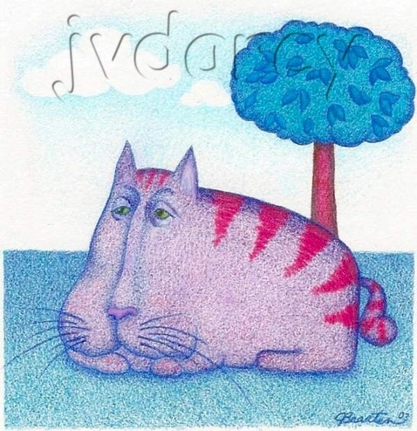
Well, okay, most people have heard of colored pencil, but I thought perhaps I would introduce some of my readers to the versatility of the technique and show some examples of what can be achieved. "Stinky Cat" to my left was rendered in colored pencil in a somewhat typical manner, layering a few colors together in places, with a certain amount of the white tooth of the paper showing through. For a few of the details, I have used various burnishing techniques to make the colors blend smoothly and achieve more detail, for instance, in the eyes and the nose. Burnishing is a technique that uses a neutral colored pencil (white, cream, or a colorless blender) layered heavily over other colors to blend the colors together and create smooth transitions. Burnishing differs from regualr drawn lines as the technique involves pressing the pencil into the paper and blending it as you go, without showing the individual lines. In the case of the cat's nose here, I used a white pencil over the dark and mid-tones to create the smooth appearance with white highlights. The eyes, on the other hand, were burnished using a colorless blender. Colorless blenders come in pencil form (basically the plastic-y wax the colored pencils are made from) or in marker form, and they will each produce their own qualities, and each has their own pros and cons. The pencil form can blend incompletely or leave a slight bloom (waxy residue) on the image, but is overall my favorite for most work, as it has the same properties as any other colored pencil. The marker style blends very smoothly and evenly in most instances, but can soak up the first color you use it on, making it difficult to get back out in order to avoid transferring it to the next color. The markers also do not seem to last terribly long in my experience. It is also common to burnish with a white, cream, or grey colored pencil. Each of these will necessarily change the tone of the colors underneath, but makes some very nice effects. I have successfully pulled off some great experiments in burnishing two or more non-neutral colors together, but, strangely, some colors mix together well while others do not. My advice is to use a secondary sheet of the same type of paper your main work is drawn on, try out several variations of two or more colors blended together, and be sure to label your experiments, in case you forget later how you achieved a great combination.

The picture to the right was created almost entirely by burnishing together bright colors with one another. The sky is a gradation made up of various shades of grey, then burnished with white, to give it a grey-sky appearance. If you look closely you can see how hard I pressed the pencil into the paper in order to mix it together and seal the tooth of the paper at the same time.
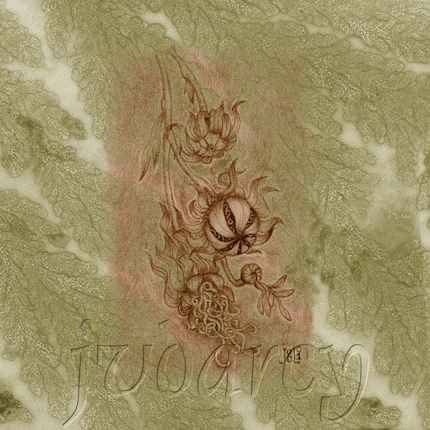
Both of the images shown in this post are for sale in my Etsy shop!