Showing posts with label art techniques. Show all posts

Monday, August 11, 2008

Cool Drawing, Ugly Execution


Today's work is one that was recently downgraded from finished work, framed and hanging on the wall, to work in progress. The title of this piece is "Checking the Blue Corn Traps." The date inscribed on it, next to my signature, is 1999. I matted it and put it into a nice wood frame, and it has been hanging in various locations in my house (including the attic) for a few years now. I have always liked the design, but over the last few years, the intensity and choice of colors have really started to bug the crap out of me. I like the bright foreground colors, but they are just not intense enough, and there is much too much white space within those areas. That background purple color has recently started to make me ill just looking at it. Blech. So here's the plan: I have determined the colors I used originally (apparently, despite my posts that recommend writing down what colors you use as you are composing a new work, I glibly thought I would remember, or would never change it once it was finished), and have begun the process of punching up the foreground colors. I will probably not burnish the colors in, as I like the graininess for this image, but there is still room for a lot more pigment in the orange and red areas. The background I intend on changing completely, by overlaying (probably) true blue, as the purple just isn't working. I will try to post some snapshots as I go along, but if anyone looks at this image and thinks of the perfect solution, comments are always welcome.

Sunday, August 3, 2008

The Versatility of Colored Pencil

Well, okay, most people have heard of colored pencil, but I thought perhaps I would introduce some of my readers to the versatility of the technique and show some examples of what can be achieved. "Stinky Cat" to my left was rendered in colored pencil in a somewhat typical manner, layering a few colors together in places, with a certain amount of the white tooth of the paper showing through. For a few of the details, I have used various burnishing techniques to make the colors blend smoothly and achieve more detail, for instance, in the eyes and the nose. Burnishing is a technique that uses a neutral colored pencil (white, cream, or a colorless blender) layered heavily over other colors to blend the colors together and create smooth transitions. Burnishing differs from regualr drawn lines as the technique involves pressing the pencil into the paper and blending it as you go, without showing the individual lines. In the case of the cat's nose here, I used a white pencil over the dark and mid-tones to create the smooth appearance with white highlights. The eyes, on the other hand, were burnished using a colorless blender. Colorless blenders come in pencil form (basically the plastic-y wax the colored pencils are made from) or in marker form, and they will each produce their own qualities, and each has their own pros and cons. The pencil form can blend incompletely or leave a slight bloom (waxy residue) on the image, but is overall my favorite for most work, as it has the same properties as any other colored pencil. The marker style blends very smoothly and evenly in most instances, but can soak up the first color you use it on, making it difficult to get back out in order to avoid transferring it to the next color. The markers also do not seem to last terribly long in my experience. It is also common to burnish with a white, cream, or grey colored pencil. Each of these will necessarily change the tone of the colors underneath, but makes some very nice effects. I have successfully pulled off some great experiments in burnishing two or more non-neutral colors together, but, strangely, some colors mix together well while others do not. My advice is to use a secondary sheet of the same type of paper your main work is drawn on, try out several variations of two or more colors blended together, and be sure to label your experiments, in case you forget later how you achieved a great combination.

The picture to the right was created almost entirely by burnishing together bright colors with one another. The sky is a gradation made up of various shades of grey, then burnished with white, to give it a grey-sky appearance. If you look closely you can see how hard I pressed the pencil into the paper in order to mix it together and seal the tooth of the paper at the same time.
Both of the images shown in this post are for sale in my Etsy shop!


Wednesday, June 18, 2008

Technique for Chiaroscuro: Pastel, Pencil, Vine Charcoal

Today's medium you never heard of is more of a technique made up of several media that you have heard of, combined in a different way. The drawing at the right shows the broad range of light to dark that can be acheived with this technique, and the subtle and smooth transitions make it an ideal method for rendering the human figure.


While it appears that this drawing was made on a piece of tan paper, the paper was actually white to start with. The first step for this technique is to prepare your surface by rubbing the entire page with a thick piece of vine charcoal. It has to be vine charcoal, not compressed charcoal, as you just want enough coverage to protect the tooth of the paper (the rough surface of the paper that absorbs the pigment or pencil). This step will leave the paper a sort of uneven light gray. Next, get out your soft pastels and pick out two or three (or more) colors that range all over the color wheel. This particular drawing used a teal green, sienna, sky blue and yellow ocre. One color at a time, rub the side of the pastel across the whole sheet, not worrying too much about evenness--that'll come later. As you mix, you should be able to see your neutral background forming, and you can adjust it by adding more of one color than another to get it the way you want. Once you are satisfied with the tone, overlay with another layer of vine charcoal. This second layer of charcoal should even out the tone of the page somewhat, but if you would still like it smoother, take a wad of soft tissue (like Kleenex) and gently rub the surface in a circular pattern until the tones are even and smooth.


From this prepared surface, you will create all of the lights, darks and midtones using three tools: graphite pencil (6B to 9B, very soft), a kneaded rubber eraser, and a wad of tissue. The pencil is used to create any tones darker than the paper tone, using crosshatching or other techniques to achieve the darkness you desire. The kneaded rubber eraser is used to gently lift out the pastel colors to create the highlight areas, and you are able to lift out as much as you please, from a little lighter to all the way back to white. The wad of tissue acts as sort of another type of eraser, but this one helps blend unwanted lights or darks back to the background midtone.


Overall, the technique is very versatile, fairly forgiving, and gives extremely satisfying results. Try it for yourself sometime!


The above images were created by me, Julie D'Arcy, and are for sale in my Etsy shop!

Friday, June 6, 2008

First Medium You Never Heard Of: Silverpoint

Rembrandt's Portrait of His Wife
I decided to start with a medium that was near and dear to my heart. This technique was invented in ancient times, was revived during the Renaissance by the great masters, and then revived again in more modern times by late 20th century artists such as Picasso and Joseph Stella.

 Silverpoint (broadly referred to as Metalpoint) uses a thin silver wire (usually Fine Silver, which is 99.9% silver, or Sterling Silver, which is 97.5% silver) to draw very delicate, fine lines on a specially prepared surface. The technique is not limited to silver, as I have used 22K gold wire and pure copper wire, and in ancient times, lead, bronze and possibly other metals were used. This thin metal wire is usually wrapped with or around something so the artist can hold onto it better while drawing. Historically, the wire could be wrapped around a pencil or stick, allowing only the tip to extend out past the end. In my own experience, I use modern mechanical pencil holders, as they come ready to accommodate a variety of widths.

The specially prepared surface (support) can be virtually anything--canvas, wood, parchment--but is most commonly paper. Whichever support is chosen must then be treated with a primer to give the paper some "tooth" (grittiness). In ancient times, this primer was a mixture of binding agent (think something sticky--gum arabic, spit, other stuff that is even more nasty sounding) and white pigment (could be anything--ground up bone, chalk, ashes). In modern times, artists generally use common gesso, an acrylic-based primer. This painted surface can be sanded gently with very fine sandpaper to eliminate brushstrokes.

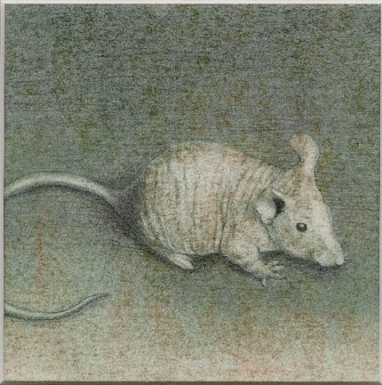
Once the artist has prepared a metal wire he or she can hold onto, and has a prepared surface, all that is left to do is start drawing. The fine lines on the page resemble the marks made by a very hard pencil, and must be built up gradually to reach the desired darkness. Generally, crosshatching, laying down many tiny parallel lines in different directions across one another, is the best way to create shading. These lines will be very silvery and even show a bit of metallic appearance at first, but over time, the metal will oxidize upon exposure to the open air and turn dark and a little brownish, as can be seen in Rembrandt's portrait of his wife at the top.
Shes Come Undone
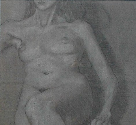
Newer metalpoint drawings will appear silvery or like they were drawn with a very hard pencil. The drawing at the right is an example of a metalpoint (silver and gold) that I made a few years ago. This drawing will probably take a long time to oxidize, as it is already framed under glass, and it currently hangs in my home, in the middle of the desert. The speed at which oxidation takes place can depend on all sorts of things, like moisture in the air, pollution, salty air. I have read about techniques to accelerate the process using dilute egg yolk solution, or an acidic solution, but have never tried any of them (so much work goes into a drawing, I can't stand the thought of ruining one).


So, the next question that comes to most people's minds is, if this technique looks so much like pencil drawing, why do it?  There are a variety of good reasons.  The fine lines you can obtain from this technique are much finer than those you can achieve with a pencil.  Another huge advantage to the artist is that these fine lines won't smudge! (Well, okay, I've gotten them to smudge a tiny bit, but only on purpose.)  Granted, because they don't smudge, lines are very difficult (but not impossible) to erase, but since most markings are built up from many small lines, you can make a few stray wrong marks with little harm.  The final reason that I can think of is the durability of the medium.  Drawings in metalpoint should last for at least as long as a pencil drawing, and the primer on the paper will help prevent the drawing from getting crumpled or bent.

So are you all ready to try it for yourself?  Go to this great site to find all of the expert advice, detailed history, and even supplies you will need to get started!