Sunday, October 12, 2008

Capturing Nature with Liquid Silver

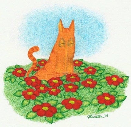
Well, okay, maybe not liquid, but certainly squishy silver. Today's feature is about another Etsy artisan, Marina McCarran, a.k.a. Meridian Studio. She creates amazing, organic snapshots of nature that you can wear! She creates these beauties using real leaves, petals, and other objects from nature and combines them with colorful semiprecious stones. Rather than making a mold and casting these natural pieces over and over again, her work is as unique as nature, because she picks her petals and uses them directly to create her forms using precious metal clay and paste. I had to do a little side research to really understand what she was talking about, since I couldn't see it, but after a quick trip to Rio Grande to look at some of these products, I think I get it. Precious metal clay or art clay silver comes in a variety of textures, but began as a clay, feeling sort of like modeling clay. The original material was invented by Mitsubishi Materials in the early 1990s, and is composed of tiny particles of metal (in this case fine silver), an organic binder and water. The resulting material can be formed by hand or pressed into things to take on their shape and texture. This form is then allowed to air dry (at which point it can be sanded and refined somewhat) then is fired in a kiln or with a torch or gas stove. The heating process burns off the binder and causes the piece to shrink a small amount. After it emerges from the heat, the result is composed of fine silver (0.999 pure silver, as opposed to sterling silver, which is 0.925 pure), is utterly indistinguishable from the pre-fired form and can be further finished by polishing, grinding, or oxidizing. The different products available today vary in firmness (from relatively hard clay to toothpaste texture to near-liquidy slip for gluing slabs together), degree of shrinkage (anywhere from 8% to 30 %), and curing time (depending on the size of silver particles).


Marina tells me that she has a couple of ways she makes these organic forms. If the leaf or petal is light and delicate, she uses the silver art clay paste, applying it with a paintbrush until there are 10 to 15 layers of paste. Once the paste has air-dried, she must carefully remove the leaf or petal, then sand the edges and add other features (stone settings, bails) made out of the clay before it is fired. These are some of her most impressive pieces--you can almost imagine the little petals nearly falling to pieces under the weight of the silver paste!


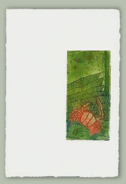
She has also created pieces using a rolled out layer of clay which she then presses the leaves into. She tells me that this method is usually reserved for more delicate, fragile objects that would fall apart under the weight of the paste. Often these leaves are dried or pressed leaves or flowers, giving her only one shot at getting it right! I have a feeling that method is the one she used for the leaf print that I purchased from her, pictured below:


As an added bonus with my purchase (and because she's such a sweetheart) she also sent me a pair of her ear-huggies! They are simple, ear-hugging designs that are comfortable to wear and so pretty! They cling right to the front of your earlobe and have small earwires that do not really show up when you're wearing them. Check them out, they are a really great idea!


Friday, October 3, 2008

Lotion in a Bar? Who'd've thought?


Today's post is a bit of a departure from my other posts. The technique I'll be talking about today involves a woman who pours her creative passion into creating Earth-friendly, vegan, luxurious body products. Her name is Nicki Leigh, and she sells her handmade bath and body products in her Etsy store, at nickileigh.etsy.com. She and I are in a Buy and Replace group together where we happily promote each other's wares and usually wind up buying from one another. She has created a unique product that I had never heard of before called a lotion bar. A lotion bar, I was told, is a solid bar of emolients that you warm up with your hands (or somehow with your body heat) and smooth it over dry hands, elbows, legs, or wherever. I asked her if it was her own invention, and she said no, that she had heard of them before, but she did come up with her own special formula. Upon questioning her further, she told me that many of the people in her family, herself included, have skin allergies and have great difficulty finding bath and body products that are not irritating to their skin. Additionally, she also said she wished to create something with vegan ingredients, as she also knew many vegans who would appreciate body products that do not contain animal products, such as beeswax. After numerous attempts at perfecting a recipe (25 or more attempts!) she found a combination of vegan oils and waxes that moisturized and softened the skin, but did not melt too easily or with too much difficulty. Further still, she came up with her own way of presentation of the product. Rather than pour the ingredients into deodorant tubes or other dispensers, she has chosen some pretty little round molds with a pattern on top. She then wraps it in wax paper and puts it in a little carrying tin. The picture above is her Lavender and Clementine Lotion Bar, the fragrance that I chose, and I find it to be a delightful citrus scent. Next on my list to try is the Green Tea and Cucumber scent, but I have a ways to go with this bar--it lasts for a long time!

Wednesday, September 3, 2008

I Am Featured on "Etsy Spotlight On" Today!


How very exciting! Please go see Blockhead Rod's blog, Etsy Spotlight On, where he interviews a different Etsy artisan every day, and today it is all about me! He has put together a very nice article--many thanks! Here's one of his funky cool sculptures on the right. You may click on it to go to his listing.

Monday, August 25, 2008

My First Fully Digitally Created Collage


Okay, there are too many adverbs in that title, but anyway...

Today I listed a completely digital creation. I created it as several layers in The Gimp. For those of you who have never heard of that, the Gimp is a shareware graphics program built originally in Unix (the name is really an acronym--Gnu Image Manipulation Program), but which has also been made available for Windows. It can do many of the cool things that the pricey Photoshop and others can do, but it is utterly free! All you have to do is figure it out. I have been able to figure out a few cool things with it, though I am not exactly a whiz or anything. I was able to create this nifty new digital collage, colorizing and combining a silverpoint drawing that I had scanned and have since misplaced (yikes!) with the electron micrograph that I had digitally scanned last month (see my post about it). I think it came out pretty well! You may click on the picture to go to my Etsy shop and purchase one for yourself!

Wednesday, August 20, 2008

Inspirational Credit Where Credit is Due


My previous post was about my new little bunny headed, long-necked, volumetric flask-bodied creation, and a little about how it was inspired by some Etsy doll-makers. I tried to include as much of my genuine inspiration in my treasury as I could find, but then I remembered another artist who I do not believe sells her work on Etsy, but is instead represented by real (b&m) galleries and her own website. Her name is Denise Greenwood, and somehow I found her on MySpace (lucky for me!). Her work can be found on her website (http://www.artofgreenwood.com/) and an example of her interesting characters is shown here. Love those lips, Denise!

Monday, August 18, 2008

Something Different--in Three Dimensions!


I just completed a treasury on Etsy of my favorite 3D figures, and these works have inspired me to create a figure of my own! He's still a work in progress, but he is tentatively named Erlen Meyer (Erl for short) because he reminds me of an Erlenmeyer flask. He is not solid polymer clay--I made him a coat-hanger armature, put a rock from the yard in his butt to make him more stable, and fleshed him out a little with aluminum foil. He stands about 4 inches tall. He's not quite ready to be baked yet, as he needs feet and probably a tail--not sure yet. I will also have to wash the dust off of him before baking--right after I took the pictures, my dog knocked him onto the floor where he sustained a few minor injuries and nice cakes of dust.

I like him so far. What do my readers think?
Afterthought: Upon further contemplation, he really is much more shaped like a volumetric flask than an Erlenmeyer, but Volumetric makes a dreadful name!

Saturday, August 16, 2008

New Abstract or New Figurative?


My last post was about a somewhat abstract work that I am improving. I have also been considering listing another older, abstract, colored pencil work, shown at the right. That image is entitled "Brownian Paisley" and is matted and framed and ready to sell. I am fairly committed to doing a lot more colored pencil, it is just a question of whether I should go in a more abstract direction or stay with the more figurative, surrealist works.

If I were to start creating a series, what should it be about? I will be doing a couple more for my Cell Series (see this link for one of them), but should I make it a larger series, or should I do something different? I would like to expand something into a series of works in order to unify the appearance of my shop. I would like for people to have an idea of what I am about from just a brief look--sometimes, that's all you get.

I have done a few long-faced cats, such as the one to the left, but I'm not sure if they would be that popular. I actually started them after completing a search on eBay of Self-Representing Artists whose items had already received bids ("cats" was among the more popular keywords, along with "nude" and "mini" which led me to briefly create the "Mini Nude Cat" series...). I love these guys, but they have not been successful sellers.
If any of my readers have any great ideas, I'd love to hear about it! Perhaps I will collect up all the ideas and create a poll here on my blog! Perhaps from there, I can create my first blog give-away contest! Who knows!

Monday, August 11, 2008

Cool Drawing, Ugly Execution


Today's work is one that was recently downgraded from finished work, framed and hanging on the wall, to work in progress. The title of this piece is "Checking the Blue Corn Traps." The date inscribed on it, next to my signature, is 1999. I matted it and put it into a nice wood frame, and it has been hanging in various locations in my house (including the attic) for a few years now. I have always liked the design, but over the last few years, the intensity and choice of colors have really started to bug the crap out of me. I like the bright foreground colors, but they are just not intense enough, and there is much too much white space within those areas. That background purple color has recently started to make me ill just looking at it. Blech. So here's the plan: I have determined the colors I used originally (apparently, despite my posts that recommend writing down what colors you use as you are composing a new work, I glibly thought I would remember, or would never change it once it was finished), and have begun the process of punching up the foreground colors. I will probably not burnish the colors in, as I like the graininess for this image, but there is still room for a lot more pigment in the orange and red areas. The background I intend on changing completely, by overlaying (probably) true blue, as the purple just isn't working. I will try to post some snapshots as I go along, but if anyone looks at this image and thinks of the perfect solution, comments are always welcome.

Sunday, August 10, 2008

Fun with Fifteen Year Old Mistakes Caught on Film


So, as I may have mentioned in my profile, I have a Ph.D. in Biochemistry from Wake Forest University. As part of my thesis project, I attempted to visualize my happy little protein of interest, integrin αIIbβ3 (if you must know), all by itself on a film, stained with uranyl acetate (a salt of uranium), by transmission electron microscopy. This particular attempt was early on in the learning process, and wanting to see something right off fairly badly, I loaded it up with a ridiculous amount of stain. So ridiculous an amount, in fact, that the stain crystallized across the membrane, and in places, made really pretty patterns. Having an artist's eye already, I took a picture of it (this was back in the day when you used real film, not digital files), and the nice folks in the EM lab developed it for me, along with the snapshots of my real experiment, and somewhere along the line, I acquired the negative. A large format negative, measuring 3.25" x 4", I managed to keep it in an envelope, stashed away, through a dozen or so changes of address through three different states. During a photography class I took several years ago, I did manage to print out a couple of prints in the University darkroom, but still couldn't do much with it. Finally, inspired by my fellow Etsy sellers who make lovely greeting cards and prints of microscopic photography (please see Etsy sellers ara133photography and EssenceFineArtImages), I found someone who could scan my original slide and put it into digital form so I could play with it. While I have only played with it a small amount in The Gimp, I thought it came out sort of pretty, and made a good excuse to blog today!

I am open to any suggestions my readers might have with how I could utilize this image, perhaps layering it with other things. The image is not for sale anywhere in my Etsy shop yet, as I am still trying to figure out what to do with it.

Sunday, August 3, 2008

The Versatility of Colored Pencil

Well, okay, most people have heard of colored pencil, but I thought perhaps I would introduce some of my readers to the versatility of the technique and show some examples of what can be achieved. "Stinky Cat" to my left was rendered in colored pencil in a somewhat typical manner, layering a few colors together in places, with a certain amount of the white tooth of the paper showing through. For a few of the details, I have used various burnishing techniques to make the colors blend smoothly and achieve more detail, for instance, in the eyes and the nose. Burnishing is a technique that uses a neutral colored pencil (white, cream, or a colorless blender) layered heavily over other colors to blend the colors together and create smooth transitions. Burnishing differs from regualr drawn lines as the technique involves pressing the pencil into the paper and blending it as you go, without showing the individual lines. In the case of the cat's nose here, I used a white pencil over the dark and mid-tones to create the smooth appearance with white highlights. The eyes, on the other hand, were burnished using a colorless blender. Colorless blenders come in pencil form (basically the plastic-y wax the colored pencils are made from) or in marker form, and they will each produce their own qualities, and each has their own pros and cons. The pencil form can blend incompletely or leave a slight bloom (waxy residue) on the image, but is overall my favorite for most work, as it has the same properties as any other colored pencil. The marker style blends very smoothly and evenly in most instances, but can soak up the first color you use it on, making it difficult to get back out in order to avoid transferring it to the next color. The markers also do not seem to last terribly long in my experience. It is also common to burnish with a white, cream, or grey colored pencil. Each of these will necessarily change the tone of the colors underneath, but makes some very nice effects. I have successfully pulled off some great experiments in burnishing two or more non-neutral colors together, but, strangely, some colors mix together well while others do not. My advice is to use a secondary sheet of the same type of paper your main work is drawn on, try out several variations of two or more colors blended together, and be sure to label your experiments, in case you forget later how you achieved a great combination.

The picture to the right was created almost entirely by burnishing together bright colors with one another. The sky is a gradation made up of various shades of grey, then burnished with white, to give it a grey-sky appearance. If you look closely you can see how hard I pressed the pencil into the paper in order to mix it together and seal the tooth of the paper at the same time.
Both of the images shown in this post are for sale in my Etsy shop!


Wednesday, June 18, 2008

Technique for Chiaroscuro: Pastel, Pencil, Vine Charcoal

Today's medium you never heard of is more of a technique made up of several media that you have heard of, combined in a different way. The drawing at the right shows the broad range of light to dark that can be acheived with this technique, and the subtle and smooth transitions make it an ideal method for rendering the human figure.


While it appears that this drawing was made on a piece of tan paper, the paper was actually white to start with. The first step for this technique is to prepare your surface by rubbing the entire page with a thick piece of vine charcoal. It has to be vine charcoal, not compressed charcoal, as you just want enough coverage to protect the tooth of the paper (the rough surface of the paper that absorbs the pigment or pencil). This step will leave the paper a sort of uneven light gray. Next, get out your soft pastels and pick out two or three (or more) colors that range all over the color wheel. This particular drawing used a teal green, sienna, sky blue and yellow ocre. One color at a time, rub the side of the pastel across the whole sheet, not worrying too much about evenness--that'll come later. As you mix, you should be able to see your neutral background forming, and you can adjust it by adding more of one color than another to get it the way you want. Once you are satisfied with the tone, overlay with another layer of vine charcoal. This second layer of charcoal should even out the tone of the page somewhat, but if you would still like it smoother, take a wad of soft tissue (like Kleenex) and gently rub the surface in a circular pattern until the tones are even and smooth.


From this prepared surface, you will create all of the lights, darks and midtones using three tools: graphite pencil (6B to 9B, very soft), a kneaded rubber eraser, and a wad of tissue. The pencil is used to create any tones darker than the paper tone, using crosshatching or other techniques to achieve the darkness you desire. The kneaded rubber eraser is used to gently lift out the pastel colors to create the highlight areas, and you are able to lift out as much as you please, from a little lighter to all the way back to white. The wad of tissue acts as sort of another type of eraser, but this one helps blend unwanted lights or darks back to the background midtone.


Overall, the technique is very versatile, fairly forgiving, and gives extremely satisfying results. Try it for yourself sometime!


The above images were created by me, Julie D'Arcy, and are for sale in my Etsy shop!

Saturday, June 14, 2008

Artistic Media You Never Heard Of: Embossed Prints

For my second installment of Artistic Media You May Have Never Heard Of, I have chosen embossed prints. A striking example of this medium is shown in the banner at the top of this blog. This medium comes under the category of printmaking because the image is transferred to the paper by running a plate of some sort through a press with a piece of damp paper. If you would like to read more about printmaking in general, please go to my lens on Squidoo entitled Printmaking in the Modern Era. While there are various methods for embossing an image into a piece of paper, this method allows you to emboss a permanent image cleanly, create a reproducible image many times, and even gives you the option of adding color to parts or all of the image at the same time. The paper used for this medium is specifically printmaking paper, I like Stonehenge or Rives BFK, because you want to have a fine art paper that can be soaked in water without curling or drying unevenly. This paper will be soaked thoroughly, excess water gently blotted off, and run trough the press with your plate or matrix.


The plate can be practically anything that can be safely run through a printing press. You can use an etched metal plate (the two koi fish in the banner at the top of the blog were created using a deeply etched zinc plate), a linoleum block plate (The Green Man featured in this article was carved out of a linoleum block), a collagraph plate, which is basically a collage of stuff (paper, plastic, found objects, lace, fishnet stockings) glued together to create texture and depth, or even just a simple flat layer of stiff board or flexible plastic (I once saw an embossed print of an angel where the plate had been cut out of a Pringles can lid!). The materials you use for your plate will determine several things: How many prints you will be able to make before your plate is no longer good, and what sort of control you have over the depth and detail of your image. Metal plates will last practically forever and make hundreds, if not thousands of prints, but the etching process requires a great deal of time and monitoring of the etch and the etched lines are decidedly sharp. Linoleum blocks are very versatile, easy to carve, and one can achieve subtle patterns and deep lines, but the force required to emboss the image is strong enough to destroy the plate after a few dozen prints. Plates created by a collagraphic process, where the 3D image is pieced together with found objects, is as versatile as you can make it, but the plate is only as strong as the materials that make up the plate, so it is this strength that determines how many prints can be created.


Whatever materials make up the plate, this method of embossing has the advantage of being rather permanent because of the quality of the printmaking paper. These beautiful papers will hold their images forever unless creased or bent, and make beautiful displays in shadow boxes.


Here are some embossed prints from my Etsy Shop to get you started!
Green Man, linoleum block print
fishy.fishy, a zinc plate etching
Coiled Snake Card, a handmade blank card printed from a linoleum block

Friday, June 6, 2008

First Medium You Never Heard Of: Silverpoint

Rembrandt's Portrait of His Wife
I decided to start with a medium that was near and dear to my heart. This technique was invented in ancient times, was revived during the Renaissance by the great masters, and then revived again in more modern times by late 20th century artists such as Picasso and Joseph Stella.

 Silverpoint (broadly referred to as Metalpoint) uses a thin silver wire (usually Fine Silver, which is 99.9% silver, or Sterling Silver, which is 97.5% silver) to draw very delicate, fine lines on a specially prepared surface. The technique is not limited to silver, as I have used 22K gold wire and pure copper wire, and in ancient times, lead, bronze and possibly other metals were used. This thin metal wire is usually wrapped with or around something so the artist can hold onto it better while drawing. Historically, the wire could be wrapped around a pencil or stick, allowing only the tip to extend out past the end. In my own experience, I use modern mechanical pencil holders, as they come ready to accommodate a variety of widths.

The specially prepared surface (support) can be virtually anything--canvas, wood, parchment--but is most commonly paper. Whichever support is chosen must then be treated with a primer to give the paper some "tooth" (grittiness). In ancient times, this primer was a mixture of binding agent (think something sticky--gum arabic, spit, other stuff that is even more nasty sounding) and white pigment (could be anything--ground up bone, chalk, ashes). In modern times, artists generally use common gesso, an acrylic-based primer. This painted surface can be sanded gently with very fine sandpaper to eliminate brushstrokes.

Once the artist has prepared a metal wire he or she can hold onto, and has a prepared surface, all that is left to do is start drawing. The fine lines on the page resemble the marks made by a very hard pencil, and must be built up gradually to reach the desired darkness. Generally, crosshatching, laying down many tiny parallel lines in different directions across one another, is the best way to create shading. These lines will be very silvery and even show a bit of metallic appearance at first, but over time, the metal will oxidize upon exposure to the open air and turn dark and a little brownish, as can be seen in Rembrandt's portrait of his wife at the top.
Shes Come Undone
Newer metalpoint drawings will appear silvery or like they were drawn with a very hard pencil. The drawing at the right is an example of a metalpoint (silver and gold) that I made a few years ago. This drawing will probably take a long time to oxidize, as it is already framed under glass, and it currently hangs in my home, in the middle of the desert. The speed at which oxidation takes place can depend on all sorts of things, like moisture in the air, pollution, salty air. I have read about techniques to accelerate the process using dilute egg yolk solution, or an acidic solution, but have never tried any of them (so much work goes into a drawing, I can't stand the thought of ruining one).


So, the next question that comes to most people's minds is, if this technique looks so much like pencil drawing, why do it?  There are a variety of good reasons.  The fine lines you can obtain from this technique are much finer than those you can achieve with a pencil.  Another huge advantage to the artist is that these fine lines won't smudge! (Well, okay, I've gotten them to smudge a tiny bit, but only on purpose.)  Granted, because they don't smudge, lines are very difficult (but not impossible) to erase, but since most markings are built up from many small lines, you can make a few stray wrong marks with little harm.  The final reason that I can think of is the durability of the medium.  Drawings in metalpoint should last for at least as long as a pencil drawing, and the primer on the paper will help prevent the drawing from getting crumpled or bent.

So are you all ready to try it for yourself?  Go to this great site to find all of the expert advice, detailed history, and even supplies you will need to get started!

Thursday, June 5, 2008

Artistic Methods You May Have Never Heard Of

I was brainstorming about what unique wisdom I could contribute to the blogging community, and I decided that traditional art techniques or other people's work probably wasn't going to get my blog noticed. So I have decided to go on a quest to seek out art forms that my readers may not have heard of before, and explain why they are worth a second look.
Off the top of my head, I've thought of embossed prints, silverpoint, encaustic, TTV photography, wire-wrapped jewelry and double-walled pottery. I'm sure there are many cool techniques out there that I haven't thought of, so if you happen upon my blog and don't see your cool medium of choice there, leave me a comment, and maybe I'll get to learn something new myself! Stay tuned!

Sunday, January 20, 2008

Image a Day -- Day 12 -- Orange Cat in Red Flowers


Today's image is another one inspired by James Christensen and his characters. Personally, I don't even have a cat any more (three dogs, my last cat ran away, 1 block, and never came back), and it's not so much that I don't like cats--it is that I like other people's cats. This one reminds me of Benjamin, a big, lazy, orange cat my Mom and I had when I was growing up. He had no problem picking out my mother's favorite flower bed and plopping himself right down in it to take a nap.
This drawing is an original colored pencil, and is available for sale in my Etsy store here.

Saturday, January 19, 2008

Image a Day -- Day 11 --Big Fat Purple Cat

I was looking through a collection of artwork by one of my favorite artists, James Christensen, and I remembered where I got the inspiration for this cat's face. If you check out some of Christensen's characters, you'll notice that this long, somber face looks a little like some of his musicians. I am currently working on a colored pencil drawing that has borrowed another of his character faces, but it is slow going. It was another one that I started, thinking I would figure out what goes on the rest of the page when I got there, and now there is here, and I am still trying to figure it out.
The purple cat was never meant to be all that complicated, just a small blurb of an image with pretty colors and cat with an odd face.
He is for sale in my Etsy store both as a print and the original.

Friday, January 18, 2008

Image a Day -- Day 10 -- "The Sun Was Well Over the Yardarm"


In this laboratory where I used to work was a man who had grown up in a rural, fairly wealthy part of Connecticut, and although he became something of a tree-hugging hippie in his later years, used to make these references to Northeastern countryclub colloquialisms. One of them was, "Well, the sun is over the yardarm," which was originally intended to mean that it was getting late in the day, and there was now a long shadow from the yardarm. If it is late in the day, then it must be proper to have one's first evening cocktail. But, if you think about it, any time the sun is up, it is over the yardarm, so really any time at all will do for the first cocktail of the day, right?
This image was inspired by that saying, as I'm imagining if your first cocktail was sometime during daylight, by sunset, the yardarm has got to start looking something like this. This picture is another colored pencil that is also not for sale, and also happens to be hanging in my kitchen (where, oddly, not that much drinking really ever occurs). I suppose I chose this one today in response to my 14 year old daughter's tyrade last night about the evils of alcohol, and how, anyone who drinks alcohol at all is going to hell in a handbasket. I really don't drink very often, so mine is probably a small handbasket with rickety handles and holes in the bottom. I should probably drink more to make it worth my while.

Thursday, January 17, 2008

Image a Day -- Day 9 -- Brownian Paisley


I don't often create truly abstract images, they usually have some reference to something. This image was an attempt to create something truly abstract. It really doesn't have anything to do with anything, except that I thought of the title, "Brownian Paisley," which struck me as a nifty title, and drew the design from that. I love the idea of starting with something with structure, and then just injecting a left turn in one's thought process (I'd use the word "random," but as a scientist, I know that nothing is truly random, especially something created by humans, plus the word has been recently banished from use by Lake Superior State University as trite and horribly over- and misused.) Just the idea of trying to imitate the fractal patterns inherent in Brownian motion just with pencils and paper is a big part of what being an artist is all about--imitating nature, while at the same time, creating something that wasn't there before.
This image was rendered in colored pencil, and is the first of the Image a Day Series that is not for sale in my Etsy store. It is framed and hanging in my kitchen. There's lots of other Brownian motion in my kitchen to keep it company.


Wednesday, January 16, 2008

Image a Day -- Day 8 -- Feeling a Little Crabby


In honor of feeling a little crabby, today's image is my tiny crab, an aquatint and etching in two colors. Originally part of a 6" x 9" etched zinc plate, the plate was not coated correctly, and as a result got horribly pitted during the etching process. I bemoaned my mistake for a little while, then looked over the printed image again, and determined that the lower right corner, intended to be part of my signature, looked okay. So I put the plate in the giant metal plate cutter and hacked it out. The resulting plate only measures about 1.5" x 3". I printed a few of these off-center prints on tiny pieces of paper, and printed a few on greeting cards. I applied the green and blue inks to the background with gloved fingers, then changed gloves, and applied the orange-red to the crab. If you look at the crab's back closely, my signature appears: a J, two O's on top of one another, and an L (JOOL). After printing, while the ink was still wet, I sprinkled tiny bits of copper powder on the background area.
This print is, of course, for sale in my Etsy store.

Tuesday, January 15, 2008

Image a Day -- Day 7 -- Snakeprint

Today's image is another embossed print, the plate created from a circular portion of a linoleum block, printed onto soaked Rives BFK paper. It is an image of a coiled snake, and only measures about 2" across. I printed this image as a set of blank greeting cards, and they are, if I say so myself, even nicer looking in person. I have already written about the difficulties taking detailed pictures of embossed prints with the digital camera, and this one was no exception.
For now, it is available as individual cards in my shop, but I just found a cache of them in a storage box, so I will probably list them as a set of 5 or 6 as well.

Sunday, January 13, 2008

Day 6 -- Image a Day -- Imaginary Biology


In honor of the latest sale from my Etsy store, today's image is from my Cell Series. This was the first of four tiny colored pencil drawings designed after living cells. Inflammatory cells, such as monocytes, lymphocytes, and granulocytes, mediate the response in our bloodstream to invaders of all sorts, secreting chemicals which enroll other cells into the fight, and undergoing dramatic shape changes to suit their roll as defenders. This cell is no specific inflammatory cell, but it is getting ready to respond to some sort of invading threat. Plus the colors are pretty.

While I just sold its sister, the plant cell, this drawing is still available for purchase, as well as two more.

Also in honor of having made another sale, allow me to introduce my readers to the purchaser, who is also a clever and talented potter (no, not like the dorky kid from the movies, someone who forms clay). Her name is Katie, but on Etsy she goes by scrumdidlyump, and here's an example of her work! The grand bowl to the right is entitled "Not Yo Mama's Fruitbowl," and if you think the title's funny, go read the description. In fact, go read all her descriptions, they are very funny! Oh yeah, and go buy something!


Saturday, January 12, 2008

Image a Day Number 5 -- Something Fishy

Two koi fish swim past one another in a narrow channel bordered by two Celtic knots.

Today's image was created using one of my favorite methods, embossed printmaking. It is really not just one method but a variety. The plate used to make the impression can be created by a variety of methods, including metal plate etching, woodblock or linoleum block carving, or plastic cutting and inscribing. This plate in particular was a zinc plate that I etched in stages to create variable, but very deep etched incisions. It was printed using an etching press set on fairly tight pressure, and printed onto wet Rives BFK printmaking paper. Once the print dries, it retains the pressed image perfectly.
This edition is one of several embossed prints I have created, but it is the only one using an etched metal plate. My other plates were all linoleum block prints, which works equally well, and you can achieve softer edges and higher detail.
Probably the most difficult task related to these types of prints is trying to get pictures that show the level of detail and depth of the image with my now-geriatric digital camera. This type of image is an example of something that is actually easier to photograph accurately with a film camera, because you have total control over depth of field and exposure.
Before anyone asks, you can't scan them either. The results are even more awful. I am hoping to sell enough artwork to be able to afford a high quality digital camera, but I have a ways to go.
If any of my dear readers would like to help me with this endeavor, come buy some artwork at my Etsy shop.


Friday, January 11, 2008

Image a Day..... or so. Day 4

Okay, so I've been working on some other projects for the past couple days and completely forgot about my Image of the Day. I have also recently begun working as a proofreader and editor through an online company called Scribendi. I worked for them a few years ago, but took a very long break--fortunately they were willing to take me back. Sometimes being an artist is very fulfilling, but quite often I feel like I have few useful skills to offer the rest of the world. So my proofreading and editing makes me feel like I'm making a contribution to the world, one nit-picky paragraph at a time.
So, anyway, today's image is entitled "Sacred Heart--Cosmic Twist" and is available on my Etsy site. It is yet another colored pencil drawing that I started several years ago, only to leave it unfinished until recently. The funny part is that there was really only about 10% of the blue in the background left to do, and it took me about 30 minutes. I'm not sure what the image means, but, living in New Mexico, I am exposed to a lot of Latino Catholic artistic symbolism, as well as the history of splitting the atom, so I guess it just all came together like this in a grand, colorful object. Enjoy!

Tuesday, January 8, 2008

I was featured on motomoto's blog today!

Today my Dandelion was featured on motomoto's blog, along with artwork from fellow Etsy For Animals Team member mvegan5, and some others from Etsy! I'm excited! Thanks for the love, motomoto! Right back atcha!

Day 3 -- "Gertrude"

Today's picture is Gertrude. She's one of those big-haired waitresses in some diner just off of the interstate. Between the Blue Plates and the endless cups of coffee, her mind wanders off to a place where she can roam the seas, free from bad tips and old men pinching her fanny.
She is the first in a series of pencil drawings of seemingly ordinary people who live extraordinary lives, even if it's only in their own minds.
My next drawing in the series is going to be Sid the construction worker. What an imagination he has!

Gertrude is available as a 5" x 7" print in my Etsy shop here:
http://www.etsy.com/view_listing.php?listing_id=8005708


Monday, January 7, 2008

Day 2 -- The Seer

The original drawing, a colored pencil on paper, is hanging in our living room, and measures about 9" x 12". It originally started as the eyeball in the middle, and was slowly finished between about 1995 to probably about 1998 or so. The date in the corner says '96, as, at a certain point, I inscribed my signature in the lower right hand corner, thinking it would inspire me to finish it in the year that it was signed. I did the same thing to the drawing I am going to go back to work on today, it is dated '99. This time, I'll put a -'08 next to the signature (that is, if I manage to finish this one in the next twelve months).
Sometimes I come up with a great idea for a piece of a picture, and then tell myself that I will fill in the missing areas once I get there. That strategy almost never works, but at least I'm challenging myself. The other thing about this piece is that, sometimes I come up with a great title for a piece before I've even created it, and then other times, the title eludes me forever, like this one, and I just go for some lame name like "The Seer." The aforementioned picture I'm working on doesn't have a title either, so I'll probably post it somewhere in order to solicit suggestions for a title. Stay tuned.
While the original of this image is not for sale, I am selling digital prints of it in my Etsy store, here.

Sunday, January 6, 2008

Artwork a Day for 2008!!


Well let's see how many days we can keep this up...


So maybe I didn't start with the first day of the year, but I've never done this before, so I figure it's better than nothing. For a few days, I'll have images of old artwork, but the cool thing about this idea is that, pretty soon, I better start making more art to post!!

Today's image is my "Heart in a Box" ACEO. I created it one day when my husband was out of town on business, and I started getting all mushy about true love and personal freedom. To me, true love means never being "captured" by another, but being surrounded, nurtured, and supported. I have much more freedom with my honey than I ever had alone, because there were too many things I was afraid to do on my own. In fact, my husband has gotten me into things I never thought I would ever enjoy, and I've done the same for him. He's got big dreams for the future, and, thanks to him, I'm building some new dreams of my own. Together we are much more than the sum of our parts.