Sunday, September 12, 2010

Trying to create a new tatting design!

Okay, yes, I know I really need to get back to drawing, which is what I do, right? But in the meanwhile, tatting has become a fun distraction. I think between that and the shrink plastic stuff and the limited amount of wire-wrapping I've tried, I could open a new shop with jewelry, almost as scatter-brained in focus as my art shop!
My latest project is an attempt to design my own pattern simply based on ideas from others' works that I have seen. The flower motif that is stained with purple around the edges was my first attempt, and while I think it looks pretty, it doesn't lay flat and the petals of the outer flower motif overlap, which wasn't what I wanted. Still pretty though, so I was going to use it as an experimental piece and perhaps add that pretty crystal sitting next to it, maybe as a dangle coming out of the middle. The piece that is still white is my second attempt and only has a couple of mistakes. It seems to lay flat a little better, and I think it looks like a pansy, so I will probably stain the middle yellow and put some purple and blue around the edges.
I wish I knew someone in the area who also needle tatted; it would be nice to be able to look over someone's shoulder or ask questions at key points to see if there is a tidier way to do certain things. Without that benefit, I will just have to continue combing the internet for advice.

Thursday, September 9, 2010

Tatting--Another Distraction


Tatting is a form of lacemaking that dates back to the early 19th century, and, according to Wikipedia, is inexplicably thought to be derived from the French word frivolité, reflecting its complete lack of usefulness. The only other remotely interesting thing Wikipedia had to say about it was that it has been used for occupational therapy, to give recovering patients something to do with their hands. I totally get that.

I learned shuttle tatting as a bored kid from some old craft instruction booklet my Mom had, and that method of lacemaking is a fairly annoying tangle of Cat's Cradle-like knots and holding your hands and fingers just so and getting lots of knots that were not part of the instructions that
require a magnifying glass and a needle to undo (if you aren't willing to simply throw the piece away and start over). This pastime was quickly and wisely set aside for crochet and knitting and, well, art.

When I started selling my fine art on Etsy, I wandered randomly through all the categories of
handmade stuff to see what was there, and amongst all that stuff, I found
people who did tatting.
They made the usual useless doilies and lace collars, but then some of them made jewelry--really hot, Goth, steampunk, kick-ass jewelry. So I looked up some of these artists to see how they did it, and they mentioned this term called "needle tatting". I bought some tatting needles (long, straight needles with no points on the ends), procrastinated a while longer, then finally hunkered down, read the instructions, and figured it out. I had had this idea rattling around in my head that this type of lace might look really cool hand-dyed with permanent inks, so, after finding some patterns I liked, I tried my idea. Apparently, it was a fairly good one, or at least I think so. I'm not sure if I am going to sell these items in my same store or if I'm going to take them over to The Wooden Cow here in Albuquerque to see if they sell, but I'm building up quite a collection, so I guess I'd better share it. With that thought in mind, I'm sharing it here to see how it does. This last photo is the first set I made, a choker and earring set, hand dyed with turquoise ink to make a gradient going across each piece. My husband also thought it was a really nice picture, despite Mimi having her tongue stuck out.

Wednesday, September 8, 2010

I Guess I Should Get Back To My Blog

I just purchased my second batch of Moo Mini cards with about a jillion different images on them. They are so fun and eye-catching and cute that people should want to take them. I intend on leaving them in conspicuous places for people to take and then perhaps maybe check out my website once they realize it is a business card.

As I was looking at them today, it occurred to me that the web address for this damn blog of mine is on them. Well crap. Now, I love to blather on about myself and my own selfish interests and pretend someone else cares as much as the next person, but I really can't stand blogging. That's not to say that I don't read my friends' blogs because I want to read about some contest they're sponsoring or about their personal dysfunction for my own entertainment (Yes, I mean you, Erin), but as far as my own desire to waste time in THIS PARTICULAR WAY, it's just not my thing. I'm sure I'm interesting to some people, but let's face it, part of the reason I am a visual artist is because visual art doesn't necessarily need an explanation. You either like it or you don't.
But I understand that part of being an artist is letting people know who they are buying the image from. Something that helps the viewer connect with what they are buying and (hopefully) hanging up in their own home or office. Something they can relate to, or laugh about, or feel sorry for, or be proud of, or whatever.
So here's your little tidbit for today to get to know me by. My artwork is not usually chock full of meaning, I probably just created it because I thought it was a good idea at the time. Sometimes I think of a great title for an image before I've even imagined the image. For instance, the drawing "Redheads Just Aren't For Me" is, well, a portrait in effigy, and, well, the title pretty much captures the full scope and give-a-fuck-ness (yes, I know there's a real word for that, but it's my blog and I just made it up and I like it) of how I felt about a particular person at the time. Granted, I'm
pretty much over it now, but the picture came out, IMHO, pretty f***ing awesome (I hate cussing more than once in a single blog post) so I'm still pretty proud of how I used my own snarky sarcasm to mock my own pain and create it.

Then on the other hand, sometimes I imagine a picture, either in part or in its entirety, and never think of a great title and that always really bugs me. I look at it and think the image is awesome, and I show it to my friends and
family and random people on the street in the hopes that they can do my job for me and help me come up with something besides "Untitled". I wind up just using whatever lame title I can think of and running with it, like "Purple Cat", "Weedy Study" or 
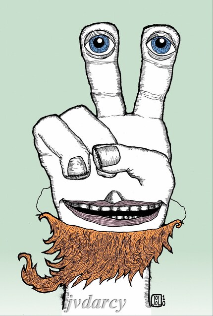
"The Seer". "The Seer" bugs me the most, because the title really makes it seem like it should mean something, but it's just a cool picture.
So there's some insight about me, and I will try to get better about writing shorter, more interesting posts about myself and the wacky sh!t I do. I promise not to blog about ironing shirts.
Tomorrow's topic, all this crazy lace I've been making, and how I feel about tatting! Sounds pretty all-encompassing, I know, but try and hold out until tomorrow.

Saturday, May 15, 2010

Selling Artwork is a Marketing Conundrum


Something I just cannot seem to figure out is how to market my artwork and get people to come and buy it. I've read many a blog post and a helpful Etsy Forum discussion, and I have even purchased someone's pdf about how to increase traffic and sales to my shop. I spend what I consider to be large amounts of time generating interest and getting feedback on my work via Facebook, Etsy Forums, twitter. I write clear, detailed descriptions and try to use properly enticing and search engine optimizing words in my titles and descriptions. I offer works that anyone could afford if they wanted to. Yet, my sales are few and far between. Plus, when the sales do come, it seems completely arbitrary. I love that a bunch of my sales have been from total strangers all the way across the country or the world, but that leaves me with no clue how they found me, nor how to find more customers like that.
Now granted, I know my shop probably has issues. No two items in my shop look like they were created by the same person. There is no unified 'look' to the shop, no prints offered in multiple sizes, no color schemes, no theme. I do not blog every week to keep people interested. Most of my work is purely art for art's sake, it serves no other function, save the few greeting cards I sell and a couple of pieces of jewelry. I'm sure I am neglecting other opportunities to make money, either by the narrow focus of products I sell or my own inability to get the word out.
Yet, there is so much advice out there, free as well as for money, one person could not possibly do everything and create new products at the same time.
For the past few weeks, I've been trying to simply generate new works, finish some old ones that have been almost finished for too long, and market by way of generating interest by showing works in progress and asking for critiques. This approach has resulted in lots of great feedback, many gushing compliments, a couple of requests for custom work (which is awesome and don't think I'm not flattered and grateful) but utterly no sales.
So I am taking a step back to try to see what I can do to focus my approach. For a long time I have been considering opening a second shop for jewelry and wearables. There'd be some polymer clay jewelry, some simple shrink plastic jewelry, some non-precious-metal wire wrapped jewelry, some altered thrift-store finds, perhaps some hand-painted shoes and purses.
Alternatively, I have thought about doing more with paper, but making it something useful. I already make a few greeting cards, but I could offer some of my digital prints as mini cards, plus make some new styles geared exclusively towards card giving. I was also considering making some hand-drawn or hand-painted notebooks and journals. I have even been offered the suggestion of making coloring books for adults from some of my images.
So I am asking advice of my readers: Which of these suggestions sound good to you? Is there stuff I haven't thought of yet? Do I have the wrong take on something? Straighten me out!

Monday, April 19, 2010

Back to Work...Well, Sort of

This weekend was full of Little League Baseball games, cleaning up the yard, rain (not a good combination), and a little bit of drawing. I took my sketchpad to the ball field (Usually when it's my own kid's game, my husband is the coach and I'm official scorekeeper. This Saturday, my kid was pool-playing for another team because they were short.) and started in on this idea I had after being inspired by some other people's work. My husband accused me of making this little creature to resemble someone from Little League, but if I did, it was subconsciously influenced only.
He was only about half-way finished by the time that game was over, and a brief jaunt to Taco Cabana later, I was back at our home field acting as Field Monitor (exactly as interesting as it sounds). After finally getting to consume my Taco Cabana burrito, I was sitting on the bleachers at a girls' softball game, finishing him up. Despite the home team's designated Chihuahua's best attempt to pose as my model, I finished him all up and put the book away to avoid any damage or criticism.


Yesterday morning, I scanned him in and got him all digitally gussied up. I switched up his colors, started with some color in his main body, then thought better of it and just left his main body white. Overall, I really like the way it turned out!
I guess it's time for me to get back to all of my other work, now. I have quite the list of responsibilities I've got to take care of today.

"Mister Softee" is now available for sale as a 6" x 8" archival print here.

Friday, April 2, 2010

Digitally Enhancing Sub-Par Drawings Works!

I was never a huge proponent of digital manipulation in and of itself, but I've been using it more and more to clean up drawings and, better yet, to add color to them! My last blog entry about Eric and the Fake Beard was an example of one that I never would have wanted to add the color with a brush, and it turned out to be a great combination of natural-looking drawn lines and the crisp perfection of digital color.

I did a similar thing a couple weeks ago with "The Frog Princess." She was a relatively simple ink drawing who simply needed a little polish by way of digital color. For that one, I even got a regular laser mouse to use left-handed, as opposed to the track ball mouse, which must be used right-handed and has less control (to me in my hands). Here she is:

I like how you can give something a subtle gradient from one color to another, or just one color to white.

So as I was perusing some of my Etsy Favorites, I came across a pen and ink artist who puts different colored backgrounds behind her botanical drawings, and even lets her customers choose which color they prefer. Her name is Jodi Davies, and she goes by jodidoodles, if you would care to check her out. (Since everyone's tastes in art are different and every artist has a different style, I don't really feel all that competitive about pointing out other awesome artists.) I thought that the different colored backgrounds with a black and white foreground was a cool idea, so I tried it on one of the drawings I finished this week (okay, the only drawing I finished this week, shhhh!).

Not only did I add the colored background, but this was the first drawing I can honestly say that I completely altered on the computer. While I was fairly happy with the flowers and leaves around the face in the middle, the face itself just looked awful. And awful in ink is a fairly permanent type of awful. But not letting a little temporary lack of drawing talent hold me back, I scanned it in and proceeded to rip the face to shreds on the computer. There was much too much crosshatching on the eyelids and the face itself was not in the middle of the circle where it should have been. I was just having an off day. It happens. But through the wonders of the digital age, I fixed most of what I disliked about it, tried not to go completely crazy fixing blemishes (kind of like putting your makeup on in the magnifying mirror, cleaning up images on the computer can get a little OCD). Then I added a square of color behind it, and picked three colors to start with as the background. Here is the result:

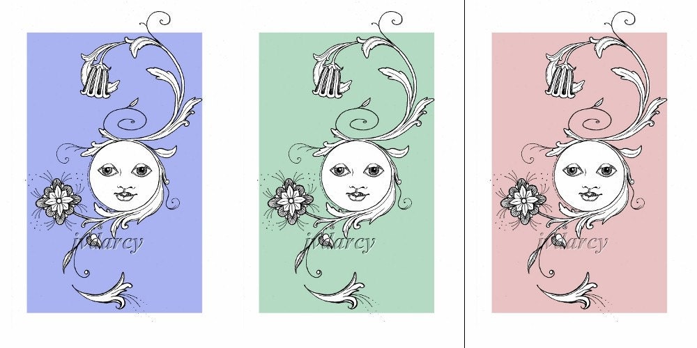
Clicking on the image above will take you to the listing for the green one, but I made a listing for each of the three colors, in case one caught someone's eye more than the others. Also noted in each listing, if any of my readers would like it in another color, all you have to do is ask! I'm not sure if I will do any more like these, but it was certainly fun and a good exercise in digital manipulation. Please let me know what you think!

Thursday, March 11, 2010

New Print! Eric and the Fake Beard

Eric and the Fake Beard

Most of the rest of the family was used to Eric’s flippant “one-eyed salute”, but tonight he seemed in an especially jovial mood. He bounced down to the dinner table wearing what appeared to be the remains of Aunt Edna’s favorite orange mohair sweater (quite honestly, everyone else hated the thing) tied by two strings around Eric’s neck.

“That better not be my favorite mohair sweater, boy,” snorted Aunt Edna as she came around the corner from the kitchen, wielding a plate of steamed vegetables and squinting at him suspiciously through the steam that had collected on her bifocals.
“You look like that wino that hangs out down the street under the bridge,” commented his sister, Juniper. “Only he bathes more!”

“June! Stop picking on your brother and go get me a serving spoon,” snapped a now-visually-acute Aunt Edna, having cleared the steam from her glasses. “I sure wish you’d ‘a asked me before you went and tore up that sweater,” she continued. “Though, I reckon it was getting a little long in the tooth.”

“Edna,” Eric’s Dad interrupted, “that sweater could have been the wino who lives under the bridge.” Everyone laughed at that, even Aunt Edna. Eric, lapping up the spirit of good humor at the table, continued to dance around, wiggling his homemade fake beard.
“Check it out,” he giggled, “I’m Brad Pitt!”

This print was inspired by the humorous illustrations of my Facebook friend, Erik Bergstrom (I modified the spelling of his name to protect whatever innocence he may have, plus I forgot to look to see how he spelled it). Okay, I guess it was also a little inspired by Brad Pitt, thought I hate to admit that, since I've never thought he was a handsome man in the slightest, so him growing some ridiculous homeless-wino-hippie beard has had no other effect on me except to make me chuckle. I actually got up in the middle of the night to draw this thing, and couldn't go to bed until I was mostly finished with it. The next day I finished it, scanned it in and added the color in The Gimp. The most difficult part was writing the story that went with it, since I'm much more of an editor than a writer (now watch me litter this post with typos...). So I hope my readers (both of them) don't think my story is too lame, it was the best I could do.
The print is for sale in my Etsy Shop here.