Monday, April 19, 2010

Back to Work...Well, Sort of

This weekend was full of Little League Baseball games, cleaning up the yard, rain (not a good combination), and a little bit of drawing. I took my sketchpad to the ball field (Usually when it's my own kid's game, my husband is the coach and I'm official scorekeeper. This Saturday, my kid was pool-playing for another team because they were short.) and started in on this idea I had after being inspired by some other people's work. My husband accused me of making this little creature to resemble someone from Little League, but if I did, it was subconsciously influenced only.
He was only about half-way finished by the time that game was over, and a brief jaunt to Taco Cabana later, I was back at our home field acting as Field Monitor (exactly as interesting as it sounds). After finally getting to consume my Taco Cabana burrito, I was sitting on the bleachers at a girls' softball game, finishing him up. Despite the home team's designated Chihuahua's best attempt to pose as my model, I finished him all up and put the book away to avoid any damage or criticism.


Yesterday morning, I scanned him in and got him all digitally gussied up. I switched up his colors, started with some color in his main body, then thought better of it and just left his main body white. Overall, I really like the way it turned out!
I guess it's time for me to get back to all of my other work, now. I have quite the list of responsibilities I've got to take care of today.

"Mister Softee" is now available for sale as a 6" x 8" archival print here.

Friday, April 2, 2010

Digitally Enhancing Sub-Par Drawings Works!

I was never a huge proponent of digital manipulation in and of itself, but I've been using it more and more to clean up drawings and, better yet, to add color to them! My last blog entry about Eric and the Fake Beard was an example of one that I never would have wanted to add the color with a brush, and it turned out to be a great combination of natural-looking drawn lines and the crisp perfection of digital color.

I did a similar thing a couple weeks ago with "The Frog Princess." She was a relatively simple ink drawing who simply needed a little polish by way of digital color. For that one, I even got a regular laser mouse to use left-handed, as opposed to the track ball mouse, which must be used right-handed and has less control (to me in my hands). Here she is:

I like how you can give something a subtle gradient from one color to another, or just one color to white.

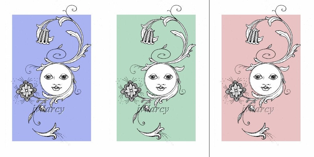
So as I was perusing some of my Etsy Favorites, I came across a pen and ink artist who puts different colored backgrounds behind her botanical drawings, and even lets her customers choose which color they prefer. Her name is Jodi Davies, and she goes by jodidoodles, if you would care to check her out. (Since everyone's tastes in art are different and every artist has a different style, I don't really feel all that competitive about pointing out other awesome artists.) I thought that the different colored backgrounds with a black and white foreground was a cool idea, so I tried it on one of the drawings I finished this week (okay, the only drawing I finished this week, shhhh!).

Not only did I add the colored background, but this was the first drawing I can honestly say that I completely altered on the computer. While I was fairly happy with the flowers and leaves around the face in the middle, the face itself just looked awful. And awful in ink is a fairly permanent type of awful. But not letting a little temporary lack of drawing talent hold me back, I scanned it in and proceeded to rip the face to shreds on the computer. There was much too much crosshatching on the eyelids and the face itself was not in the middle of the circle where it should have been. I was just having an off day. It happens. But through the wonders of the digital age, I fixed most of what I disliked about it, tried not to go completely crazy fixing blemishes (kind of like putting your makeup on in the magnifying mirror, cleaning up images on the computer can get a little OCD). Then I added a square of color behind it, and picked three colors to start with as the background. Here is the result:

Clicking on the image above will take you to the listing for the green one, but I made a listing for each of the three colors, in case one caught someone's eye more than the others. Also noted in each listing, if any of my readers would like it in another color, all you have to do is ask! I'm not sure if I will do any more like these, but it was certainly fun and a good exercise in digital manipulation. Please let me know what you think!

Thursday, March 11, 2010

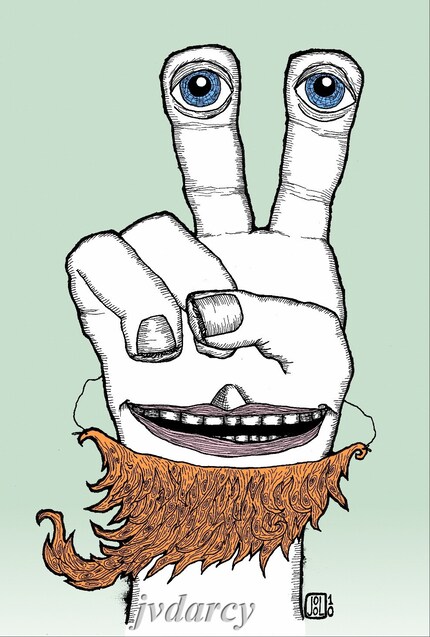
New Print! Eric and the Fake Beard

Eric and the Fake Beard

Most of the rest of the family was used to Eric’s flippant “one-eyed salute”, but tonight he seemed in an especially jovial mood. He bounced down to the dinner table wearing what appeared to be the remains of Aunt Edna’s favorite orange mohair sweater (quite honestly, everyone else hated the thing) tied by two strings around Eric’s neck.

“That better not be my favorite mohair sweater, boy,” snorted Aunt Edna as she came around the corner from the kitchen, wielding a plate of steamed vegetables and squinting at him suspiciously through the steam that had collected on her bifocals.
“You look like that wino that hangs out down the street under the bridge,” commented his sister, Juniper. “Only he bathes more!”

“June! Stop picking on your brother and go get me a serving spoon,” snapped a now-visually-acute Aunt Edna, having cleared the steam from her glasses. “I sure wish you’d ‘a asked me before you went and tore up that sweater,” she continued. “Though, I reckon it was getting a little long in the tooth.”

“Edna,” Eric’s Dad interrupted, “that sweater could have been the wino who lives under the bridge.” Everyone laughed at that, even Aunt Edna. Eric, lapping up the spirit of good humor at the table, continued to dance around, wiggling his homemade fake beard.
“Check it out,” he giggled, “I’m Brad Pitt!”

This print was inspired by the humorous illustrations of my Facebook friend, Erik Bergstrom (I modified the spelling of his name to protect whatever innocence he may have, plus I forgot to look to see how he spelled it). Okay, I guess it was also a little inspired by Brad Pitt, thought I hate to admit that, since I've never thought he was a handsome man in the slightest, so him growing some ridiculous homeless-wino-hippie beard has had no other effect on me except to make me chuckle. I actually got up in the middle of the night to draw this thing, and couldn't go to bed until I was mostly finished with it. The next day I finished it, scanned it in and added the color in The Gimp. The most difficult part was writing the story that went with it, since I'm much more of an editor than a writer (now watch me litter this post with typos...). So I hope my readers (both of them) don't think my story is too lame, it was the best I could do.
The print is for sale in my Etsy Shop here.

Tuesday, February 16, 2010

The Year of the Tiger!

Happy Lunar New Year! The New Year in the lunar calendar started on February 14th, and this year is the Year of the Tiger! To commemorate, I drew this tiger in black and red-orange ink yesterday! I had some fun with the contour-y, swirly, maybe a little mokume gane looking orange ink pattern. The black ink is waterproof Black Magic that was applied with a brush, and the orange ink was drawn on using my 0.50 Rapidograph drafting pen.


The lunar new year is celebrated in many Asian countries, and there are many shared traditions as well as ones unique to each country. The calendar is based on the Lunar (or Chinese) Zodiac. Similar to the Western zodiac, the Chinese zodiac has 12 different attributes, but each sign is given to a year, a month and an hour of the day, thereby creating the possibility of three different signs that lend attributes to a person's persona, based on when they were born. For instance, if you were born yesterday, February 15th, 2010, at 5 in the morning, you were born in the year of the Tiger, the month of the Tiger (your inner animal), and the hour of the Tiger (your secret animal). However, if you were born on, say, July 11, 1967, at 5:53 pm EDT (to use a completely arbitrary example, having nothing whatever to do with the day I was born...) you were born in the year of the Goat, in the month of the Goat (inner animal) and the hour of the Monkey (secret animal). The animal representing the year of your birth is the persona you portray to others, your external appearance. I'm not sure if I understand the meanings of the inner vs. the secret animal, except that the secret animal is the most personal, since it represents the relationship of the sun to you at the hour of your birth. Each of the animals also has an attribute of one of the five elements: Wood, Earth, Water, Metal, and Fire. These elements each contribute to the personality of the animal in some way.
The Year of the Tiger drawing measures about 8" square, and is available for sale in my Etsy Shop for a rather economical price.
Happy New Year all! Welcome to the Year of the Tiger!

Thursday, February 11, 2010

5:52 Salacia


5:52 Salacia
Originally uploaded by jvdarcy
Salacia was the bride of Neptune, the Roman God of the Sea. The story goes that when Neptune was pursuing her, she was so intimidated by his greatness that she fled and hid in the Atlantic. Neptune sent a dolphin out to bring her back, and because the dolphin was able to charm her into marrying the God, Neptune gave the dolphin a place of honor amongst the stars, the constellation Delphinus.

This is my piece for Week 5 of 52 Weeks of Creations! I was a week behind, so I just decided to call this one my contribution for this week instead of last week. She started out as simply a study in ink textures and was really fun to create! The only un-fun thing was changing the ink in the pen (my 00 Rapidograph, see rant below) from blue to green, then remembering to wash it all out when I was finished so the ink wouldn't dry that way. I have some really interesting photos of what happens when you let the ink dry in the mixing cup...

Salacia measures 6" x 8" and was rendered in pen and ink and brushed liquid ink.

Monday, January 18, 2010

Rapidograph Rant.


So, being the child, step-child and grandchild of professional writer stock, I'll call that my excuse to love pens. I do, I love pens. One of my earliest memories of drawing anything involves these cheap, black metal ballpoint pens with some sort of government inscription on the side that my Dad always seemed to have laying around the house (in my vague, couldn't-read-yet, three-year-old's perspective, I want to say they just said "U.S. Government" on the side, but since I couldn't actually read yet, they could have said "Uncle Barney's Government Surplus and Podiatric Supplies," yet, I can hardly see how that would have fit on the side of the pen). Those black ballpoint pens were so sleak, simple, fun to chew on and made a nice, even, smooth line on whatever paper I could find (or the radiator in the dining room). Since that time, I've gone through many different styles of pens: Ballpoints, which eventually grew thin on my patience with their inconsistent skipping and oily, uneven marks, erasable pens, which, until I learned to write sideways, simply amplified the left-handed curse of "black pinkie knuckle," rollerballs, which, though beautiful, smeared way too easily, no matter how long I left myself in suspended animation with my hand poised above the page, thinking, certainly, it was dry by now.

With this love of permanent writing impliments, coupled with my artistic inclination, it was only a matter of time before I went down that slippery slope to my affection for drafting pens. For whatever reason, my fascination with their permanent, archival nature was only peaked when I found out that you could buy them with tips so fine you could perform a trachiotomy on a housefly with one. Not cheap these little buggers were, either. And it seemed, the finer the point, the more expensive they were, and the more difficult to care for. It seemed also that the tiniest of points on these pens were also insanely fragile. Couple that with the fact that the diameter of the tip now approached the molecular diameter of the ink particles, and you've got a rather expensive, no-one-told-me-this-was-a-one-use-only pen. As a teen, I managed to save up my nickels until I could afford to buy one of my own, only to get completely burned by my own lack of experience and care, getting the thing utterly clogged with ink and the tip bent irreparably at the same time. I have no idea what happened to that pen. I hope it is burning in pen hell.

That being said, I completely forgot this lesson a couple years ago (or perhaps I thought I was mature enough, as those of us over forty sometimes think, to own something complicated and expensive without effing it up) and bought myself a set of four Rapidograph pens from Koh-i-noor. Old school, just like the one I toasted in high school, only now there's four of them. I had completely forgotten the labor involved in keeping them functional, and today is a lesson in patience, wherein I am presently waiting for the nib of one of them (pictured above) to dry after cleaning the clots of old India ink out of them. I really just wanted to draw something real quick and be done with it.
But hey, my loss is your, well, also loss, since this is probably the most rambling-on-about-nothing blog posting I've ever written. I think the nib is dry now, but now someone needs to be driven somewhere, so I guess it'll be especially dry by the time I get back.

Monday, January 11, 2010

New Year, Resolutions, and a New Project!

In honor of the New Year, I decided to create a new project for myself to keep me productive throughout the year. I had considered joining one of the groups on Flickr or Facebook along the lines of "52 Weeks of ..." but I couldn't find a project that I really wanted to do. So I started my own group! I sent out invitations to all of the artist friends I have, and now there's a group of about 45 of us. The idea is that each of us commits to ourselves to start and finish one piece along our chosen theme each week. The theme and medium is up to each participant, as we have photographers, painters, jewelers, a bit of everything, and we all seem to be inspired by different ideas. I couldn't decide, so I chose two, 52 Weeks of Creatures and 52 Weeks of Vocabulary Words. We also have 52 Weeks of: Squares, insects, monsters, journaling, spirituality and "undeclared" (I think there's a bunch of those--don't judge! It's enough for most artists just to commit to this kind of schedule in the first place!).

You can find the group here: 52 Weeks of Creations!

Here are my entries for this week. The first one is for 52 Weeks of Vocabulary Words, and this week's word is "Miasmata":
miasmata. n. plural of miasma.

1. noxious exhalations from putrescent organic matter; poisonous effluvia or germs polluting the atmosphere.

2. a dangerous, foreboding, or deathlike influence or atmosphere.

While the singular, "miasma", is pretty cool, I thought the plural of this word was even better. In the olden days (before the germ theory of disease transmission) it was thought that illness and disease were emitted from dead and decaying materials and that they carried through the air like a spirit.


Entry #1 for the 52 Weeks of Creatures is my "Devil Child Waiting for the Bus":

She requires far less explanation. She is simply a little girl waiting for her bus. She just happens to have horns and a tail, for which her Mommy has lovingly crafted her a matching set of hat and, umm, tail-mitten?
She reminds me of the two adorable girls (twins) who lived behind us. They were the cutest little blue-eyed blonde girls, who would spend their spare time verbally torturing our dogs over the wall and trying to knock birds' nests out of trees with sticks. I used to call them the Evil Twins.
Just because something's cute doesn't mean it won't try to eat your face off.
Neither piece is listed for sale in my shop just yet, still trying to decide if I should do so. Stay tuned.